Poster Analysis
What are the primary and secondary hooks?/ what do we see first and second?
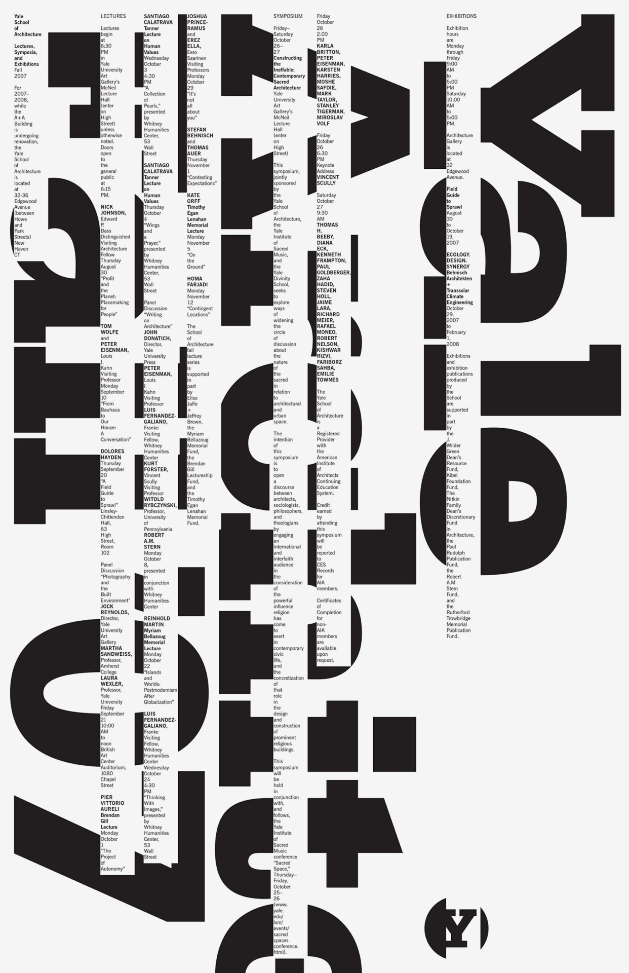
The primary hook is the big, vertical, and bold type “Yale Architecture Fall ’07” stemming across the entire poster. The secondary hook includes the smaller type that crosses over the bolder type. The circle with the “Y” inside could also be considered secondary type but is seen before the smaller type.
Count the levels of type. / Size / Weight / italics
I counted about 5 levels of type:
Vertical, bold, and big type: level 1
“Y” inside circle: level 2
Small all-caps and bold type: level 3
Small lowercase bold type: level 4
Small regular type: level 5
Discuss how it navigates. / eye travels without getting stuck
I found that the eye starts with the big, bold, vertical type – travelling right to left. The eye will then make its way towards the first column of small type from left to right and reading it from top to bottom, ending at the circle with the “Y”. Even though we are used to reading type from left to right, this poster creates something special by inviting the viewer to start from the right instead.
What aspect of it creates energy? / Design is exciting to view
The boldness of the large type really sets the vibe for the poster. The type is exciting, bold, and in your face. The small type intertwines through the primary type in a creative way which helps the viewer divide information up. Although the smaller type is linear and is created with a grid, it creates a wonderful contrast from the big black primary type that helps with legibility. It’s almost like the poster has physics – like the type is “falling” – I love how that was accomplished with just black and white type.
How does it handle white space? / effective structural space
The poster handles white space in a way that breaks up the text for easy legibility, while also creating a route for the eye to travel down. The white space makes room for the smaller type to live in, which creates a beautiful grid. It breaks up the large bold type so that it still reads well but also “cuts” through the existing type in an artistic way.
What makes it work? / overall impression and how it achieves impact
Overall, the poster is very successful in catching your eye, and getting the info across in a way that makes sense that is artistically pleasing to look at. It reads well and has a lot of information on it that can still be read and understood.