What are the primary and secondary hooks
What we see first in this poster is the large text that almost makes up a background of the image. The next hook we see is the large negative space columns running down the poster, in a way these almost grab your attention first.
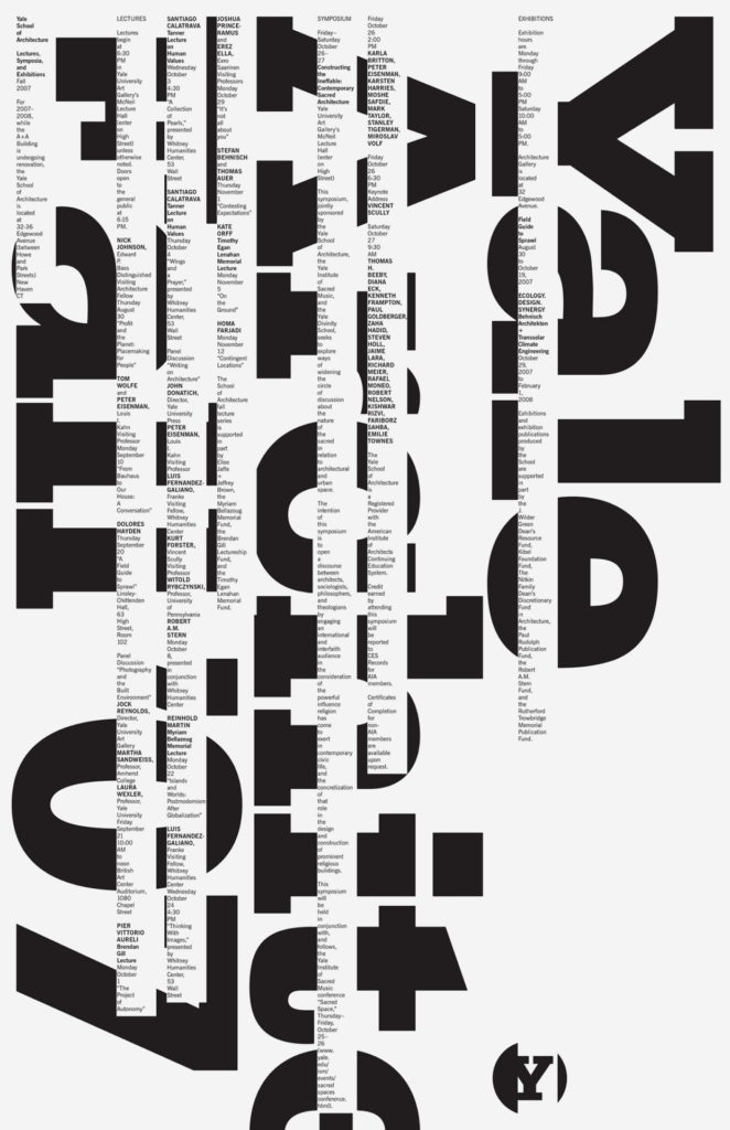
Levels of Typography
In this poster there are 4 levels of type (4 if you include the logo) The first level is the bold background type, next is the all cap bold headings with the bold mixed case headings being after that. The final level is the regular weight body copy.
How does it navigate?
For me this poster starts in the upper right corner with Yale grabbing your attention. After that you try to read the rest of what it is saying, once you are successful at that your eye lands somewhere in the middle of the page with the all caps bold naming. The columns the type live in that are located above the background type allow your eyes to travel up and down the page. Finally the last thing you see is the logo in the bottom corner, letting your eye bounce off that and back to the rest of the page.
What aspects of it create energy?
The columns situated over large bold type creates an exciting almost rebelling against the type kind of energy. Another thing in this design that creates energy is the large type bleeding off the page. It doesn’t even finish the word architecture but you know what the rest of it says.
How does it handle white space?
This poster handles white space in an extremely interesting way. I notice that some of the columns “finish” in an area where they don’t have type behind them, even then you can still see the white rectangular box that they live within. The structure of the type being contained in those columns makes it’s own space.
What makes it work?
I think what makes this poster work is the extreme levels of hierarchy within the poster. I also think something that makes it work is the rigidity of the columns, in a way this invokes a sense of structure that resembles architecture. Another thing that makes this poster work is that it is on an 11 or 13 columns grid, always creating some sort of asymmetric feel that is exciting for an otherwise boring topic.