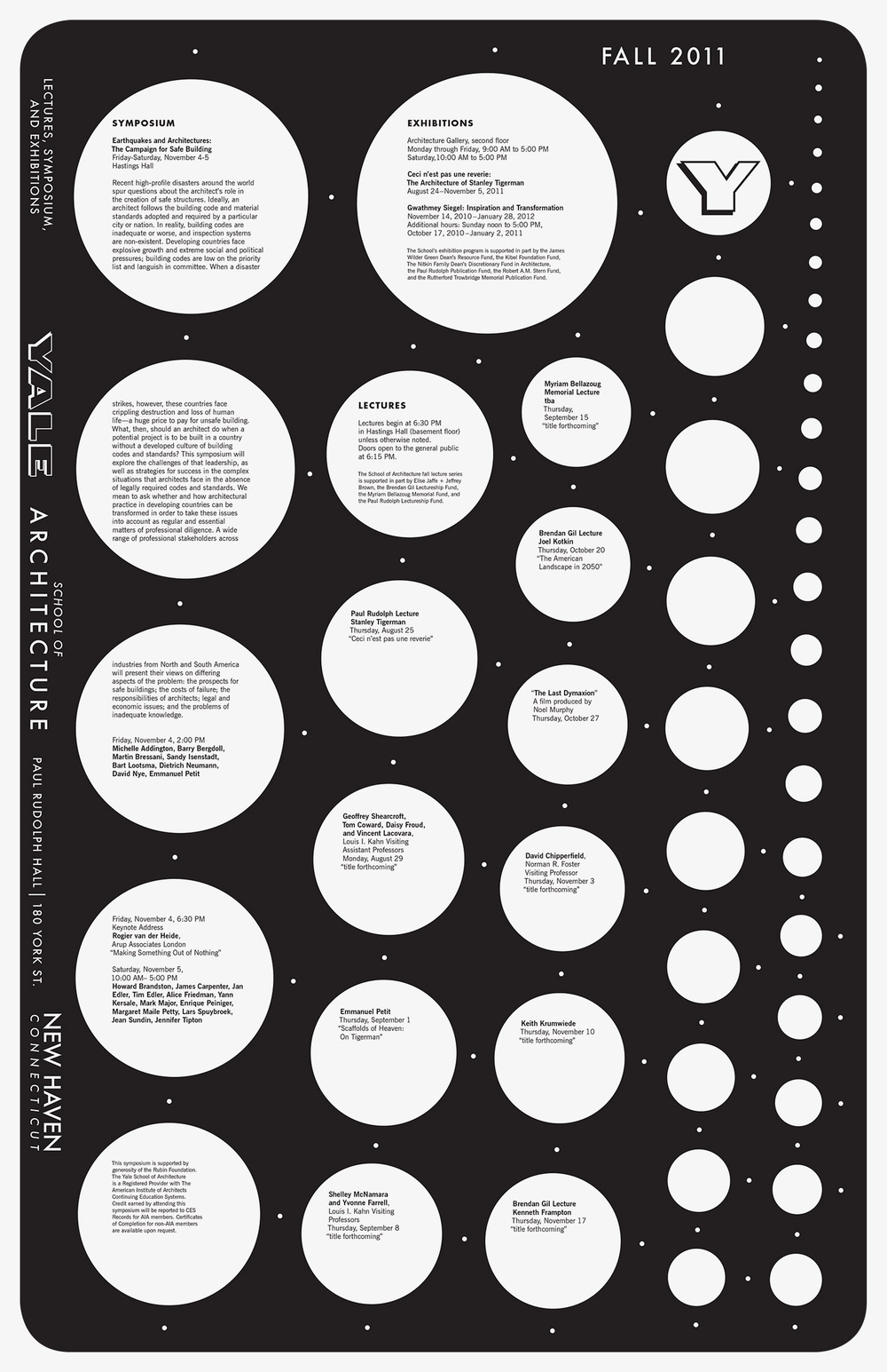
The primary hook of this poster is definitely the white circles with text, that differentiate in both size and positioning. The secondary hook would be the text that is within the circles themselves, and what they say or detail.
There are two distinct levels of type on this poster. The first is the text surrounding the left edge of the poster, along with the “FALL 2011” in the top right, which is larger in scale and more profound, despite being less obvious to the eye. The second level is the smaller, yet more striking text within the many circles on the poster.
The poster navigates through the size of the circles. Your eyes naturally gravitate toward the larger circles near the top and the left, and slowly read toward the smaller circles. Somewhere along reading the poster you also see the sideways writing.
This poster handles white space well in my opinion, as the circles (which then turn into dots in the top right) are the white space and are used as a pattern to display the information.
The uniqueness of the pattern and the black-and-white spread make this poster work, along with how striking and different the text placement is compared to the usual poster you may see. Despite the text mostly being smaller than an average poster, this poster still sticks out in its uniqueness.