Primary & Secondary Hooks
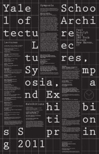
The primary hook in this poster is the large white type “Yale School of Architecture” and so on. This type immediately pops out of the poster due to it’s size and contrast with the black background. The secondary hooks appears to be the dashed grid that makes up the structure of the poster. I look at the type and wonder why it is broken up this way, leading me straight to the grid. The grid covers the entirety of the poster but isn’t the primary hook, as it falls slightly into the background due to the thin weight of the line in comparison to the bold type. I would also argue that the address is the secondary hook as it is the second level of type hierarchy and, placed uniquely for the poster, in its own box.
Levels of Type
There are 5 levels of type hierarchy in this poster
- Large grid type (Yale School of Architecture)
- Information headings/address (Exhibitions)
- Bold, small, body text
- Regular small body text
- Regular, smaller, body text (who the art is supported by)
How does it navigate?
This poster starts by navigating your eye through the grid as you read the large text. It is the primary level of type but takes a moment to read as it travels down the page while being slightly broken up among the grid lines. After reading the bold text the poster brings me to the address, which is called out in it’s own box, being the only lone type in the grid, it catches your eye. Then the poster leads you through the smaller type which fits perfect in the grid boxes that it is structured on. This navigates from left to right, Lectures, Exhibitions, and Symposia.
What aspect creates energy?
The structure of this poster creates energy. The grid provides a lot of the energy for me as it is bold and interesting with the broken up type. The contrast between the larger and smaller type contributes to this as well, if the type sizes were closer together it would be visually confusing, but it is very clear what information is to be read in order. As this series of poster is black and white, the contrast with the colors gives it energy as well.
How does it handle white space?
This poster handles white space (I guess black space in this case) by not filling the grid completely. the white space is used as letter spacing in between words, allowing this poster to be readable.
What makes it work?
This poster works because it is bold and effectively gets their message across, as it is an informational poster about an event. The grid is a visually interesting way to draw you in, and the easy navigation as well as extreme contrast with color and the levels of hierarchy makes this poster successful.