What are the primary and secondary hooks?
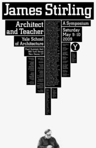
The primary hook is the large “James Stirling” text at the very top of the page. I found the secondary hook becomes either the following “Architect and Teacher underneath the name on the left or the image of the subject at the very bottom that is separate from the top text/design on the page.
Count the levels of type.
I found 7 Levels of type in this poster. The large font at the top, leading to a second large text in four sections of the poster. Then a third size that is found in one section. After it becomes smaller text in one large center paragraph leading down the page. The remaining boxes have two small point fonts as well as one with a small point, bold font.
Discuss how it navigates.
The movement works down the page, flowing easily with text size. Starting at the very top, your eye then travels to both left and right sides of the page with the second largest font size. It catches another font size underneath and then travels down the rectangular boxes with the more crowded, fine print text. With how the small text is in vertical retangles, it leads me to bring my eyes back to the top of the page momentarily to read the text. Once reaching the bottom text box, my eyes settle on the man (presuming to be James Stirling) at the very bottom of the poster.
What aspect of it creates energy?
The compact area of the boxes creates this very striking energy. It keeps your view to the top of the page as the boldness of the black boxes are more striking than the negative white space. The use of white text on a black background creates an eye catching design that you could spot from far away. The large text at the top immediately draws the eye, setting the tone for the poster. Basically saying “Look at me, this is who I am, read about me.”
How does it handle white space?
The use of white space makes the triangular shape the boxes create. Having that negative space allows for the image of the person not to be lost and still stand out. The image of the person isn’t contrasting the black text boxes enough on its own; which is where the negative space comes in to make both sections, top and bottom, stand out on the same poster.
What makes it work?
The simplicity of the black boxes make it easy to read and understand, but the layout of those boxes (giving a upside down triangle-ish shape) is what draws you in. It’s bold and simple for an informational poster about a person, which makes it effective.