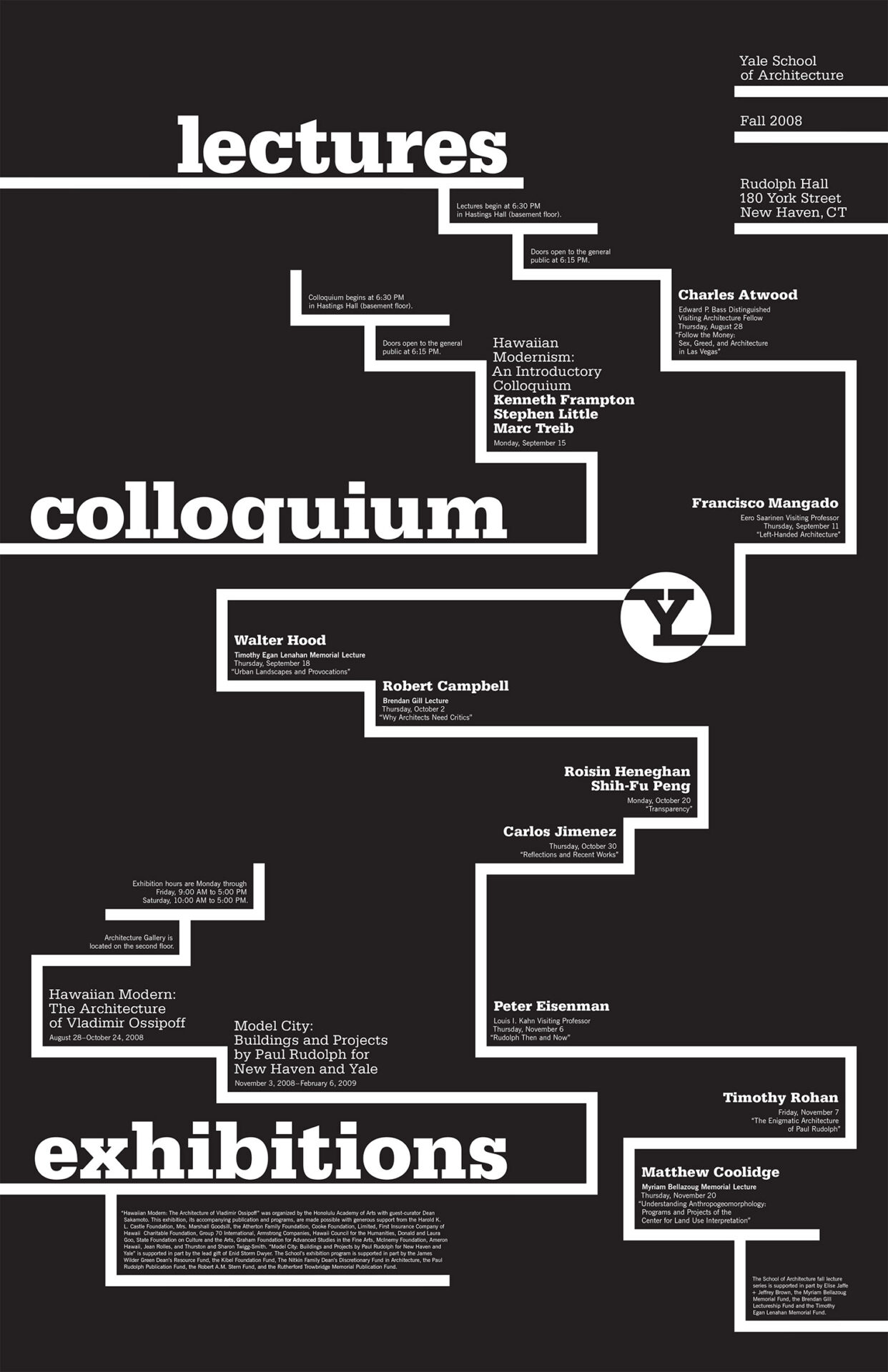
What are the primary and secondary hooks?
The primary hooks are definitely the title words of ‘lectures’, ‘colloquium’, and ‘exhibitions’, as well as the logo. The secondary hooks as far as type goes would likely be the speaker names. That said, even though it isn’t type, the second thing my eye is drawn to is easily the lines.
Count the levels of type.
- The title words are large and bold and in all lowercase.
- The titles of the lectures/exhibitions, as well as the information about Yale, are smaller, and are in title case.
- The speakers’ names are bold, and are also in title case and at the same size as the titles.
- Further information is even smaller, and is in title case as well.
- Finally, there are a few paragraphs at the bottom of the poster that look to be in an even smaller size. They are also in title case.
Discuss how it navigates.
The eye notices the title words and logo, and from there the lines guide you very nicely across the page. The navigation is asymmetrical and varies based on where the lines go – some of them lead up while others go down, and they can go from left to right and back again – but it still feels well structured and easy to understand.
What aspect of it creates energy?
The lines make the layout very interesting to me. They feel very intentional, and do a great job at directing the viewer. The title words being so much larger than any other type also adds to it. It really feels like it’s all connected, even though the lines don’t all directly connect to each other.
How does it handle white space?
The space there is feels very balanced to me – there’s not too much of it in one spot, and nothing is too crowded.
What makes it work?
The large type of the title as well as the lines really pop out at the viewer and grab attention. I know if I was walking by and saw this poster, I would likely stop to look at the rest of it.