- What are the primary and secondary hooks?/ what do we see first and second?
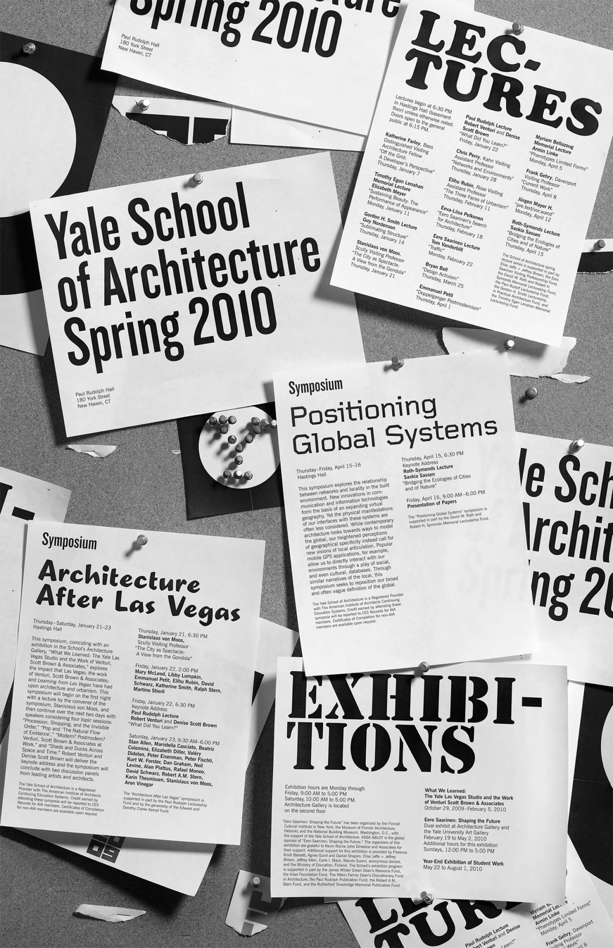
The primary hook is the Title of Yale School of Architecture Spring 2010, then your eye moves to Positioning Global Systems as the secondary hook.
- Count the levels of type. / Size / Weight / italics
I counted 8 Levels of type throughout the poster.
- “Yale School of Architecture Spring 2010”: Large Typeface, Bold, Sans Serif
- Subtext and body text: Regular text, sans serif
- Regular title text: Bold text, sans serif
- Symposium title: same typeface as #1, smaller and left aligned at the top.
- “Positioning Global Systems”: Separate typeface than others, regular text, large
- “Architecture After Las Vegas”: Display typeface, bold, large
- “Exhibitions”: Army-type display typeface, bold, large
- “Lectures”: Playful serif typeface, bold, large
- Discuss how it navigates. / eye travels without getting stuck
The eye starts at the “Yale Architecture” title, then travels down to “Positioning Global Systems”, Then to “exhibitions” or “Architecture after Las Vegas”. Then the eye travels back up to “Lectures”.
- What aspect of it creates energy? / Design is exciting to view
The design aspect of it being posters layered AS a poster gives it energy and makes it interesting. It highlights information within tactful layering, inviting the viewer to read what is “hidden”. It also compliments the energy of Architecture, a messy and planning-filled practice that often includes cork boards and papers everywhere like the poster depicts.
- How does it handle white space? / effective structural space
The white space is used tactfully to make the poster not seem too busy to view. It is just the right amount of chaos on the page, and the eye easily follows the intended train. The white stands starkly against the grey of the implied cork board and helps to highlight the information on the “flyers”.
- What makes it work? / overall impression and how it achieves impact
It plays with a messy and plan-filled theme, which is attractive and familiar to those who would be interested in architecture. It is designed in a way that your eye can easily find the desired information while being engaging and creative to draw an audience in the first place. The use of varying title typefaces plays along with the idea that this poster is a cork board with different posters pinned haphazardly to it, but not in a manner that would be unattractive or unappealing to view. It is every bit intentional while trying to seem unintentional.