What are the primary and secondary hooks?
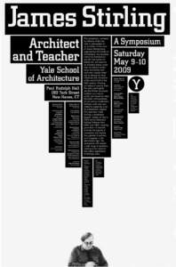
The first thing that jumps out is the huge text at the top that says “James Stirling.” With the text being so big and bold, it makes it hard to miss. Your eyes then naturally go to the next biggest words, “Architect and Teacher” and “Yale School of Architecture.” Those pieces feel like the second layer that pulls you in before you start looking into the smaller details.
Count the levels of type:
01 Primary Level
-
Super big, bold uppercase
02 Secondary Level
-
Medium bold type
-
Same size bold
-
Slightly smaller but still bold uppercase
03 Tertiary Level
-
Smaller body text that explains the symposium and lists out the schedule
04 Other Levels
-
Occasional italics in the body text
-
The tiniest type for sponsors and accessibility info at the bottom
Discuss how it navigates:
When you look at the poster, your eyes automatically start at the big name at the top, then move down to all the smaller information blocks.
What aspect of it creates energy?
The energy comes from the huge difference in type sizes and the way the text is stacked up. The headline feels massive, and then all the smaller text blocks almost look like pieces of a building.
How does it handle white space?
The top half of the poster is covered with black for the most part, while the bottom is almost completely white except for the photo of Stirling. That empty space makes the top feel even heavier and more dramatic. The white space also keeps the whole thing from feeling too cluttered, giving the words room to breathe.
What makes it work?
This poster works because it’s simple but bold. The headline grabs you while the small text brings the detail without overwhelming the viewer. The mix of big and small type adds energy, and the big empty space at the bottom balances everything out.