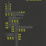
These are the works that I chose from the reading. The first one is by Trace Byrd. This poster was in a collection of three, there were minor changes between them, but this black and yellow poster stood out. The negative space in this poster feels very active due to the shape the grid is creating even though the poster is heavier on the left side. The shape guides your eye through the information from the top down and aims down to the right. I think the type size difference is pleasing, and it was a great choice to make the numbers stand out in their own size and color that pops off the page. This plays with the grid by turning some of the numbers on their sides. I also think the look of very small type in this grid is intriguing!
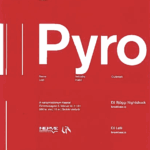
The second poster seems to be by Ragnar Freyr. This stood out immediately color wise, the white on red is super high contrast. I like this poster because it pairs very large type with very small type. There is a lot of empty space, but it doesn’t feel empty at all. I also enjoy that the type doesn’t start where the grid starts, they skipped a few boxes on the left, making it more visually interesting. I didn’t see another poster in this that used this same treatment to this extent.
This reading felt like a good recap on grids, so I wouldn’t say I discovered anything new, but a great tool for this project. I also enjoyed seeing some more type poster examples. It did however make me think about grids in the real world as they were mentioning city versus suburban streets. The roads in the city were made in a grid intentionally to make navigation easy. I drove on some roads today that were the complete opposite of that. So grids aren’t just helpful here on my computer, I want them on my roads as well.
Some aspects of this reading that I could apply to my posters are using the grid “as a starting point in an evolving process”, thinking about some diagonal grid lines, and limiting the type variations.