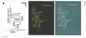
This particular set of posters by Trace Byrd I found interesting. I enjoyed the minimal color palettes and seeing how it works with the type hierarchy. The composition stuck with me as I found the use of negative space on the right to be effective, as well as how the text is facing/turned to be the orientation (vertical or horizontal) that it is boxed in (columns or rows). I think I tend to forget I could design in a similar way, breaking the standard front facing direction that text appears as and using the grid directions to the fullest.
I don’t believe I had learned anything particularly new through the text, but I had gotten a lot of inspiration through the images provided in the article. One quote that struck me was “A skilled designer uses a grid actively, not passively, allowing the modules to suggest intriguing shapes and surprising placements for elements.” It’s another note I should remember as I am working on this project and future projects with grids. I tend to box myself in and not think of how much I can push the boundaries of the grids and create more unique and interesting designs.