Which works resonate from the reading?
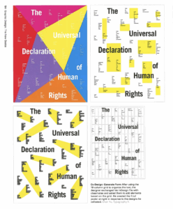
The Universal Declaration of Human Rights posters stood out to me the most. I liked how they used a grid, but still felt like it had movement because of the slanted shapes behind the type.
What did you discover about grids that you did not know?
I thought grids were just there to make things look neat, but what I learned was that they can actually create the flow of the poster. Sometimes breaking the grid makes things more visually exciting as well. I also didn’t realize how much online layouts like Pinterest boards or Google search have influenced the way designers think about grids.
What aspects of this reading could apply to how you take on your posters?
For my posters, I want to use grids to keep things structured but not feel stuck to them. I like the idea of breaking or tilting parts of the layout to make it more energetic. I also want to use white space more intentionally so it feels like part of the design instead of just blank areas.