- Which works resonate from the reading? Include a screen snap.
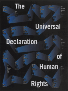
I like the way the text becomes a ribbon around the page and how the title jumps out and creates its own space that the other text has to bend to.
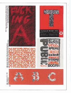
I like all the works shown here, but the layout really bothers me in the negative space between the Fucking A and T posters. I don’t know if it was a conscious decision or not. Everything is evenly spaced except there. It could have corrected by shrinking the Public poster below it to make the space more fair.
- What did you discover about grids that you did not know?
I discovered the idea of how grids create a democracy in design. I’d never really considered them from that equalizing perspective before. I like the concept that for one part of the grid to become larger or smaller, the other aspects have to agree to it.
- What aspects of this reading could apply to how you take on your posters?
I can apply the ideas of democracy and using shapes beyond straight lines in my grids.