Which works resonate from the reading?
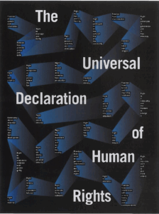
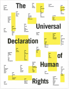
These particular works stuck out to me at first glance. The poster on the left utilizes shapes in a way that draws the eye across the page – it almost feels like a board game. Taking a stop at each column of text until reaching the end of the page – this poster draws the eye well. I also appreciate the use of a gradient, I always love a textured gradient. It gives the work some depth and mood. I have a similar sentiment with the poster on the right, as it uses minimal color and shapes to draw the eye. I enjoy the layout of the type and how it works hand-in-hand with the contrast of the yellow blocks. Overall – very cool!
What did you discover about grids that you did not know?
I learned that grids don’t necessarily need to be square/blocky – it’s possible to use all types of shapes like circles, angled, and offset. The cells and nodes of a grid can be used to generate complex patterns and designs to reinforce visual relationships.
What aspects of this reading could apply to how you take on your posters?
I enjoy the mix/diversity of shapes and type, I think it’s something I’d like to try and explore in my posters going forward.