Which works resonate from the reading? Include a screen snap.
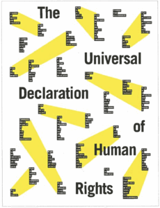
This work resonated with me because of how well balanced it is. The entirety of the space is activated, and the color and bold type are placed evenly throughout- no area feels unbalanced. The grid is strongly present here, but the composition is still dynamic and not “too perfect.” I also enjoy how certain ideas are tied to others using the yellow shapes, which provides order when reading.
What did you discover about grids that you did not know?
I like what Lupton said about how the grid makes the entire surface available for use- the edges become just as important as the center. I’ve never thought about how the grid activates the space before, and the margins and edges are crucial in creating a clean, professional looking design. I was also intrigued by the patterns she created using the grid- and how she placed in several circular shapes to create complex, symmetrical patterns. I’ve yet to experiment with this and would like to.
What aspects of this reading could apply to how you take on your posters?
I would like to get more comfortable with white space. Not every area in a grid has to be filled, and I find myself wanting to even when that air and contrast could lead to a more captivating design. I would also like to work with placing content into a nine square grid, and see what results I could create. I tend to just create my own grids as I go, but would like to get more practice with pre-determined ones.