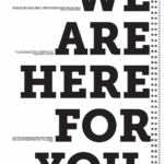
Top 3 Gestalt Principles:
- Closure – There are rectangles of white space between the big text that is continued by the smaller text. By having 3 sides of text around this white space it creates the illusion of a rectangle even though there is nothing there.
- Continuity – The flow of my poster is from left to right. There is lots going on in the left side with tightly packed text that leads into the larger more spaces out text and back into the smaller text. This creates a cascade from left to right.
- Similarity – In my poster there are two levels of similarity the smaller text and the larger text. Having these two be different makes them stand out from eachother.
There are 3 levels of hierarchy in my poster: 1.) The large all caps text 2.) The medium sized text packed tightly together on the left 3.) The small text on the right. The most important information is the “WE ARE HERE FOR YOU” and thats why its the biggest. This is meant to draw the viewer in and get them curious about who is here for them and why, then when they get up close they will see its about Taco Bell!