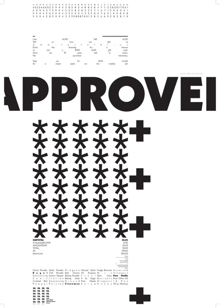
Gestalt Principles
Top 3 principles at work: Closure, Proximity, and Similarity.
How do the principles work: I find that my poster is in need of some major change, so the gestalt principles at work are underperforming in my opinion. However, there are some principles that are in play! All my text is fit within an axis, mostly the Y axis, which represents closure. Even though the boxes, or axes, are not fully closed it still reads as one single column. Proximity is in play as well where relevant information is placed next to each other (or it should be in places where it is not). For example, the total price information is located next to the list of items bought. Similarity is found within the type, as there are only three levels and a single font, creating lots of similarity throughout the poster. This creates unity through the top and bottom of the poster, with some force justified bodies of text sandwiching the subject. Again, I think I need to reformat this poster to be more successful, so the gestalt principles in play are subject to change.
Hierarchy of Information: My hierarchy is a little wacky. Approved is the primary text, and you will definitely read it first. The secondary text is found in the asterisks and plus signs. Lastly, all the other text is tertiary and less important. In retrospect, this creates almost no meaning and WILL BE CHANGED! When creating my poster, I have been more focused on laying the text out on the page in a satisfying way, but I have not been considering the main element of gestalt; How is the design unified as a whole.
P.S. The poster with no border shown above is basically unreadable and looks terrible! This is something I will be considering when redesigning…