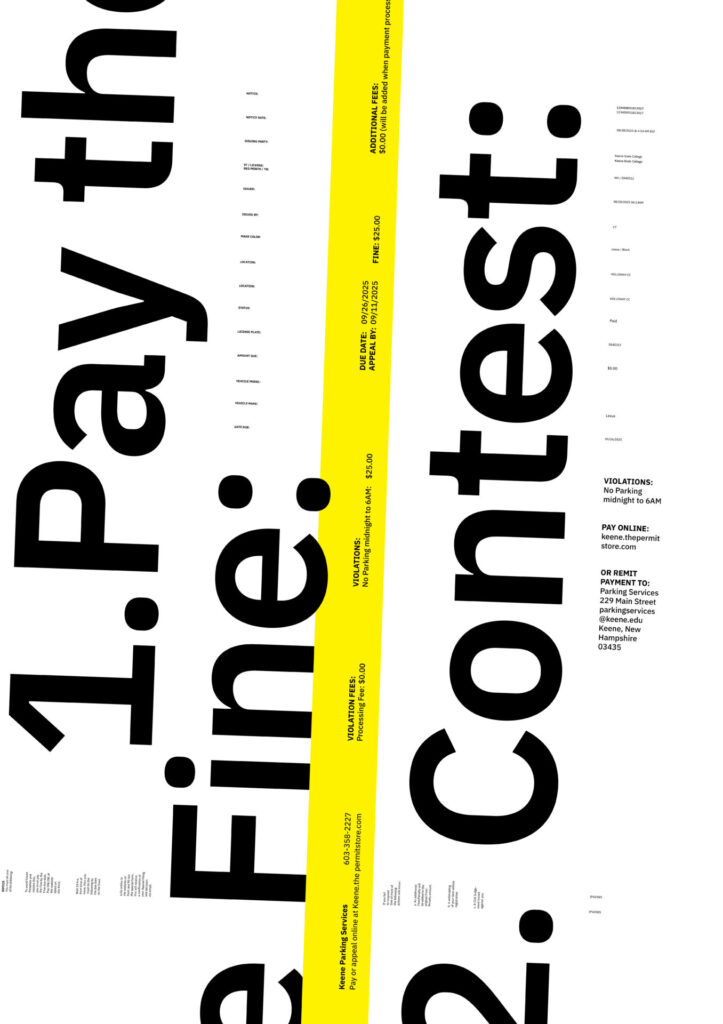
How does each principle work in this poster
Continuity is at work in this poster with the first and largest level of type. Continuity is created because the type is broken and forced onto the next line, creating a line that your eye will automatically follow to complete the sentence / headline.
Similarity is at work in this poster in the simplest level in this poster in terms of type sizes. There are three type sizes creating similarity in each category. When there is a heading or something else it is bold creating a dis similarity have the information that needs to be perceived first standing out.
Proximity is at play in this poster in terms of how information is grouped with each other, in the yellow bar for example type is grouped on the same orientation in the poster for second level of information. The next way it is at play is how type is “chunked/grouped” around the page with like information being close to each other.\
Hiearchy of information and how does it create meaning
The first live of information is your options, you can either pay the fine or contest the fine. This tells you that the poster is talking about a ticket, bill or invoice of some sort. The next hierarchy of information is the violations section, first the type on the size talking about payment options or remittance options. The next level you move to from there is the violations in the yellow bar which gives you more information about what you’re paying and why you have to pay it. From there it is then on to the smallest level of information which starts at the top of the page. This information reads from left to right showing the specific details of the ticket. The next bit of information that you read is the column of type at the bottom telling you that you must do something, this information relates to the options that are the biggest level on the page bringing you back around to the beginning of the poster.