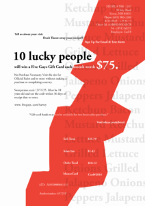
The first Gestalt principle that I believe is highly prevalent in this poster is the Hierarchy principle. This is due to the eyes first looking at the “ten lucky people,” which was purposeful in its pursuit to start the story of how these ten lucky people will win the gift cards. Then, the method by which the ten lucky people will win the gift cards is explained below the part that stands out the most as a secondary component. This is meaningful to me because it presents an opportunity to someone, and should be highlighted among the other text in the receipt as something more than standard information.
The second Gestalt principle I employed in my poster is asymmetry, which relates to the principle of harmony/balance. Harmony/balance are design principles that can help with controlling the level of order in a poster or art piece. Examples of this can be whether you want to look at a poster as one cohesive unit or have one side heavier than the other to demand attention. This principle was applied to my poster with the “ten lucky people” again, and the large red strip that navigates from the top right to the bottom left of the poster, which is meant to assist in legibility for the phrases that are overlapping with the low-opacity list of burger ingredients in the background. Another use is at the bottom, where there is less density of type, and the information kinda tails off. The information here is less important, but I still wanted it somewhat connected to the rest of the poster’s type. It’s meaningful because the asymmetry is bringing attention to the content that the viewer is meant to read first, which will increase the odds they stick around and read the whole poster.
A third and final Gestalt principle I put in my poster is continuity. The type is meant to capture your attention at the top and have your eyes travel down, following the snake trail, so to speak, yet it is all connected in a sequentially. There is also the background list that employs this principle as well, due to the fact that the list follows a single-file line all the way down the page. The hierarchy of information starts with the pitch of the survey, then the other, less important information is part of the snake’s body and tail, to be viewed in the most natural order. The meaning is to accentuate the information that is going to grab the reader’s attention the most, and give a clear direction to look for follow-up information.