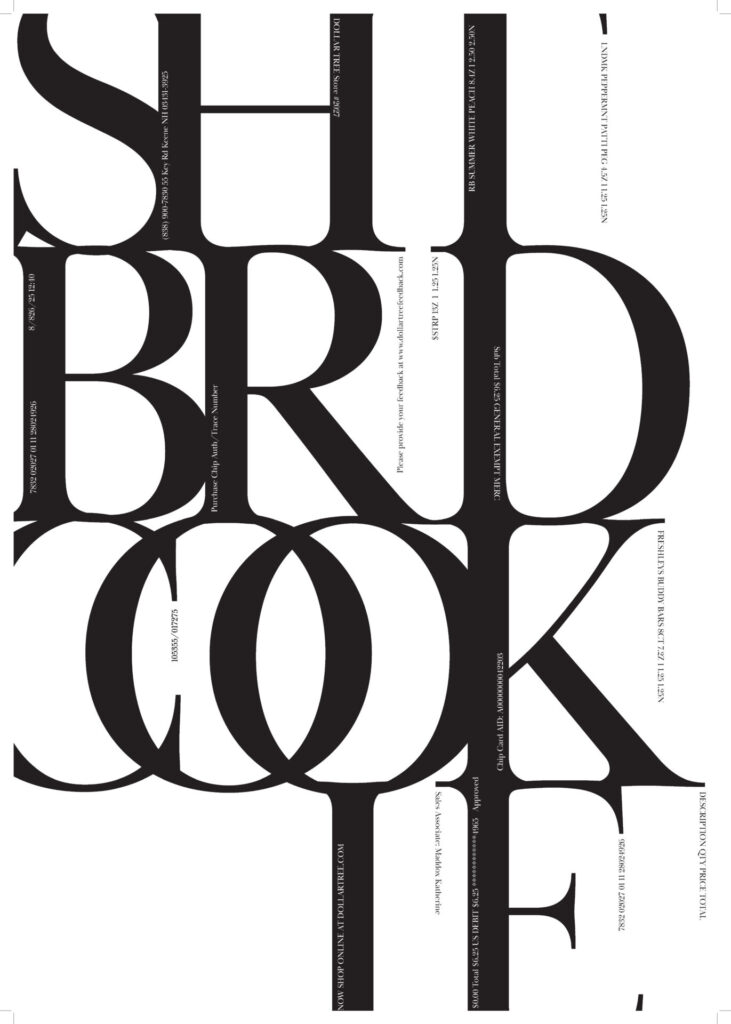
The Top Three Gestalt Principles in This Poster:
One Gestalt Principle that I noticed was Emphasis/Contrast. The emphasis is on the large black text ‘SHTBRDCOOKIE’ and is the attractor from a long distance away from the poster. The letter forms are connected in a way that they are very contrasted with the white space they share space with. On a smaller scale, I use contrast the emphasize the smaller text within and next to the bigger text. Another principle is the Law of Past Experience. The serifs on the tips of the letter forms are similar to fonts used in luxurious/fancy establishments, so that’s what you assume the poster is going to be about. Then you read the word and assume the word is shitbird cookie when, instead, it was originally shortbread cookie, making you take a second to reevaluate the poster as a whole. It becomes humorous. Continuation is a third principle of my poster that sticks out to me. This is because the largest text is connected in a way where your eyes travel from letter to letter, even when the word is split in two. Secondarily, there is a continuation with the smaller text getting led to from the serifs of the letter forms from off the page.
Hierarchy and Meaning:
SHTBRDCOOKIE is the heading, followed by the smaller text. Personally, I read the smaller text from top left to bottom right regardless of color in no particular order, but they do lead from one to the other as they read up or down and point towards another line.