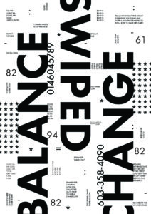
Similarity
Similarity is used in the poster with my three levels of type, grouping them together. The largest type size showcases this in a very bold way. I chose three words that relate to each other and placed them in a similar fashion to show that they are grouped together. I also used the other two type sizes to show similarity by only using type at the smallest size, and important numbers with the medium size. Combining these ideas allows for my groups to stand out even further in terms of how similar they are.
Continuation
With my large type I aimed to create a line of type that is readable vertically. I used the fact that we read left to right in order to make this work. You start at the word balance, which leads to the top of the page, where the word swiped begins. I reflected the word swiped to account for the reading orientation. At the end of the word it leads you to the beginning of the last one, change, ending at the other end of the poster. This continuation line of reading takes the viewer from the bottom left to the top right of the poster with a line that spans across the entire page.
Symmetry (near symmetry)
I used near symmetry by reflecting the large type to create a bold and visually interesting focal point of the poster. I created balance within the poster using this, as well as furthering the idea that they are classified in the same group. I also used near symmetry with the asterisk pattern, reflecting it on each edge of the poster, again creating balance with a dense pattern.
Hierarchy
The hierarchy of this poster starts with the large, ‘balance, swiped, change’ vertical type across the poster. This gives you a sense of what the poster is about, a card transaction. I put the words in order of how the transaction would be performed, and made the word swipe travel down the page to evoke a swiping motion. The next level of type is the numbers and patterns. The short numbers correspond with the items purchased, which is more abstract, since taken out of context it is not grouped with the items. I did this to allow the viewer to wonder what they could represent, making you want to read the rest of the information. It also includes other important numbers such as the phone number of the store and the survey number. I included the patterns and punctuation at this size to create visual interest, as we don’t normally see these marks at this size. I liked to think of them as typography sprinkles. The last level of type hierarchy is the small blurbs of text. These contextualize the poster and further the story of the shopping transaction. You are able to see prices, required receipt information, and messages from the store.