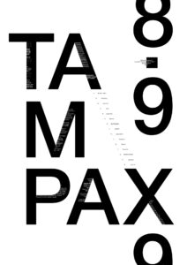
Closure (Reification)
Closure is when we take visually incomplete shapes and complete them – like taking a square and cutting parts out of it. Our minds will automatically see it as a square even though it’s not completely filled in. My poster uses this method with the vertical “8.99” type. Even though the last “9” is cut off, you can still tell it’s another nine. Similarly I use this principle in the hidden white text within the letter forms to create a 3D effect that insuates there are white shapes – even though it’s just type.
Continuation
Continuation is when we group visual elements that seem to follow a continuous path in a particular direction. I use this method as my primary focus in my poster as I used the axis of the “A” and “X” to create a line of type that continues diagonally down to the other elements of the poster. The human eye follows the path of the letters to see a continuous flow of visual elements rather than the separated letters on their own.
Proximity
Proximity is the method of grouping/spacing out objects together. When you have multiple elements grouped together, the mind sees it as one object, vice versa. I could argue this also a main focus of my poster as I have “TAMPAX” grouped together in a block since it’s my main message. I use this vertically as well for the “8.99” but have it more spread out in comparison to the TAMPAX.
What is the hierarchy of information and how does it create meaning?
The hierarchy of information on this poster starts with the “TAMPAX”. It’s the biggest and boldest item on the poster and I did that intentionally as it’s the item I wanted to highlight. I used this same method with the vertical “8.99” to draw attention to the price of said Tampax. I want the viewer to understand Tampons are $8.99 – and to think about it . Call it my feminist rage poster if you will, but I wanted to reinforce the idea that women are buying $8.99 worth of tampons everything month – at least that’s the message I wanted to post. I chose a contrasting smaller type because I didn’t want to overwhelm to rest of the message. I used it within the TAMPAX letter forms to create almost a visual optical illusion (tried at least) of 3D depth. The smaller type that follows the axis of the A and X are meant to highlight the rest of the items and to draw the viewer from top left to bottom right of the poster.