Valentine D’Efilippo
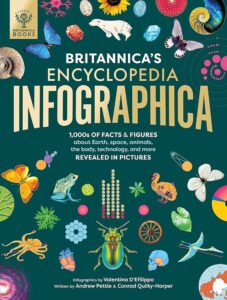
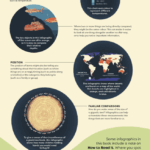
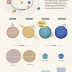
I chose Valentine D’Efilippo’s work on the book Britannica’s Encyclopedia Infographica. This book is designed for children and takes you on an informative journey through “the planet, the universe, the animal kingdom, and our body.” I think this book immediately stood out to me because it feels a little different than some of D’Efilippo’s other designs. A lot of her information design uses thin flowing lines and tiny motifs, whereas her book design feels bolder. I think the use of a broader color palate makes it stand out with high contrast and pop off the page. The illustration style feels whimsical yet scientific, which makes me look at the imagery and want to read about it, a huge win for information design. I think this would create interest, especially for children, to combine their interest for the world to learning information through design.
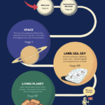
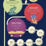
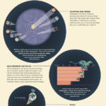
The interior pages is where the information design takes off. The designs feel very bold and childlike, matching the cover with its style and color choices. The type designs on these pages are very simple and clear. Their is an obvious type hierarchy that makes it easy to go through the pages and understand the information. She creates a unique type structure because their is a various amount of illustration set ups on each page. Although the type is places very differently on each page, they completely relate to each other based on how the type itself is set. The placement of the text flows through each page and is overall very effective and makes me want to read more!
Giulia Mangenelli
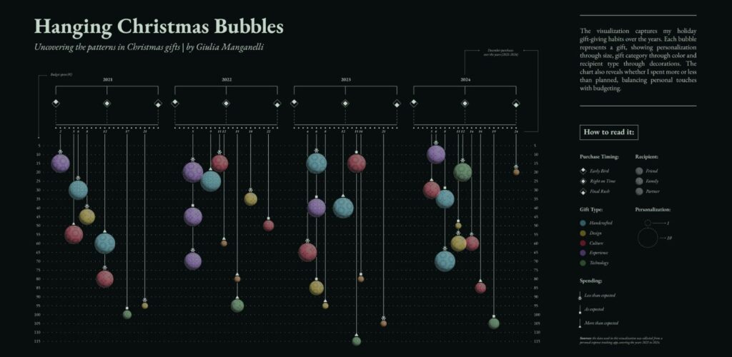
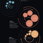
I chose Giulia Manganelli as my second information designer. She currently works at Sheldon Studio, a socially focused data design studio based in Italy. Most of her designs include a very distinct key somewhere on the page in order to decode the design. A lot of her information design seems to be from personal data over an amount of time. For example The Hanging Christmas Bubbles shows information from her Christmas shopping habits over a few years, and the Thailand 2024 design organizes information about her experiences during a month long trip through Thailand. I chose Giulia Manganelli because it looks like she experiments a lot with her set up of the information design. I like that she is trying different ways to display the information!
I think Giulia’s work is related to Valentine D’Efilippo’s work because of the thin delicate lines that show up in a lot of the designs. The Hanging Christmas Bubbles design immediately reminded me of D’Efilippo’s Poppy Field design. In both of these designs, each aspect of the illustration relates to the display of information. For example, the size of the poppies represents the amount of people that were killed in a certain historical event, and the size of the Christmas bulbs represents the personalization of the gift she bought. This goes for the stem height, length, and curves in the Poppy Field, and the length, position, hanger, gift type, and recipient of the Hanging Christmas Bubbles.