Valentina D’Efilippo
New Year, New You?
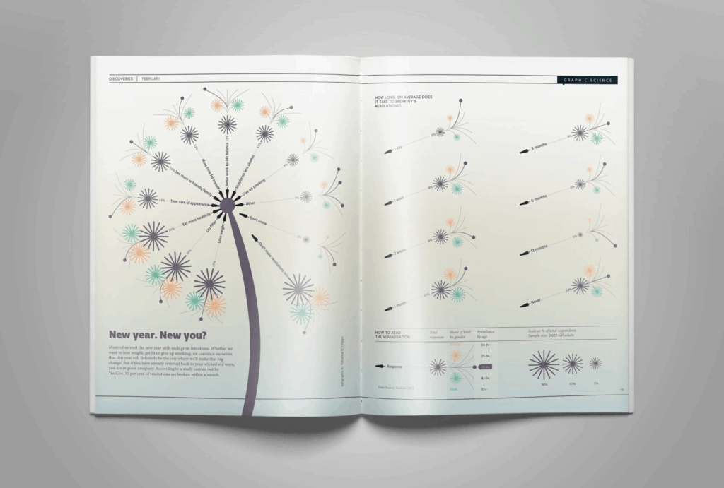
I chose to look into this infographic by Valentina D’Efilippo entitled “New Year, New You?” because of its initial eye-catching and intriguing quality. At first glance, there is not much that can be immediately gathered about the infographic, but after observing and reading about it I learned that it depicts a series of findings on new year’s resolutions. It shows data on how long the resolutions last before being broken, what people wish for the most, and it is split into number of responses, gender, and age. It is in the shape of a dandelion to refer to the practice of making a wish or resolution by blowing the seeds off of the flower. This infographic is interesting because it can make us reflect on our own resolutions and how often they are broken, and it also is a great example of how any kind of data can be turned into a dynamic infographic like this one.
This infographic allows for insight because of its clear and simple organization. It is formatted in a unique but recognizable shape which makes it engaging, and the more we interact with the information, the more we are able to dissect it and learn. It is also about a universal and relatable topic to most people which makes us more curious to learn about the data of other people.
The use of color in this infographic is clean and subtle and is not the main focal point of the design, which I think is a successful move in this particular instance. One color is applied to each subset of information which makes the information easy to navigate. The type is a simple, sans serif typeface and all of the type within the design itself is on the same level. The shapes used are eye-catching but simple, and there are no extra distracting design elements which adds to the overall simplicity and how easy it is to navigate and understand.
Giorgia Lupi
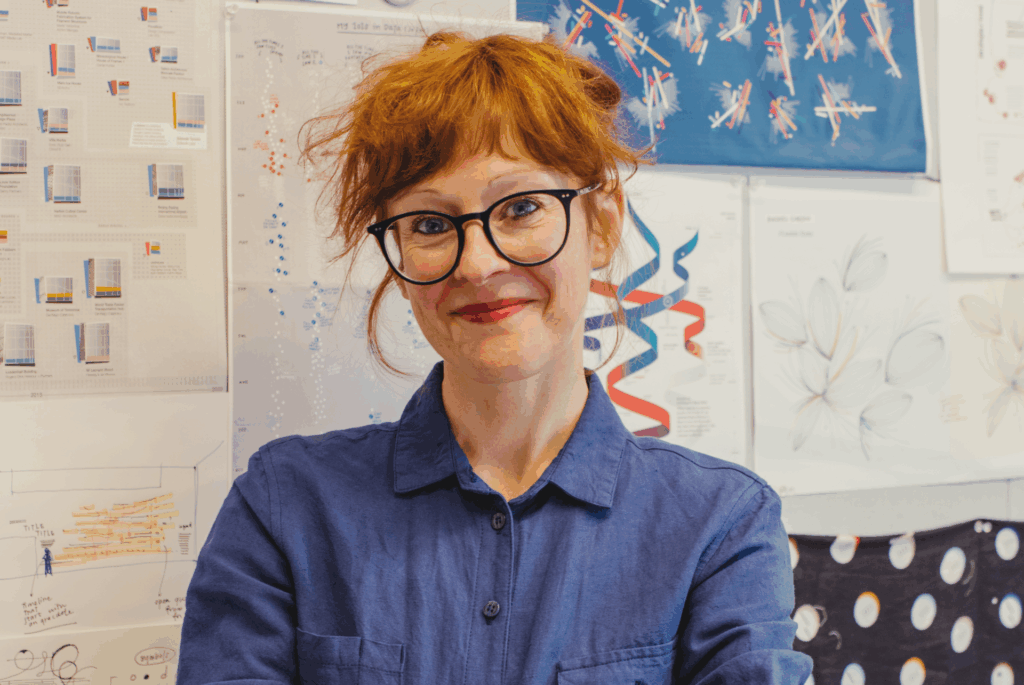
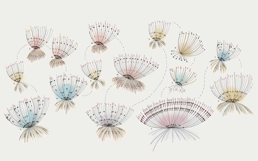
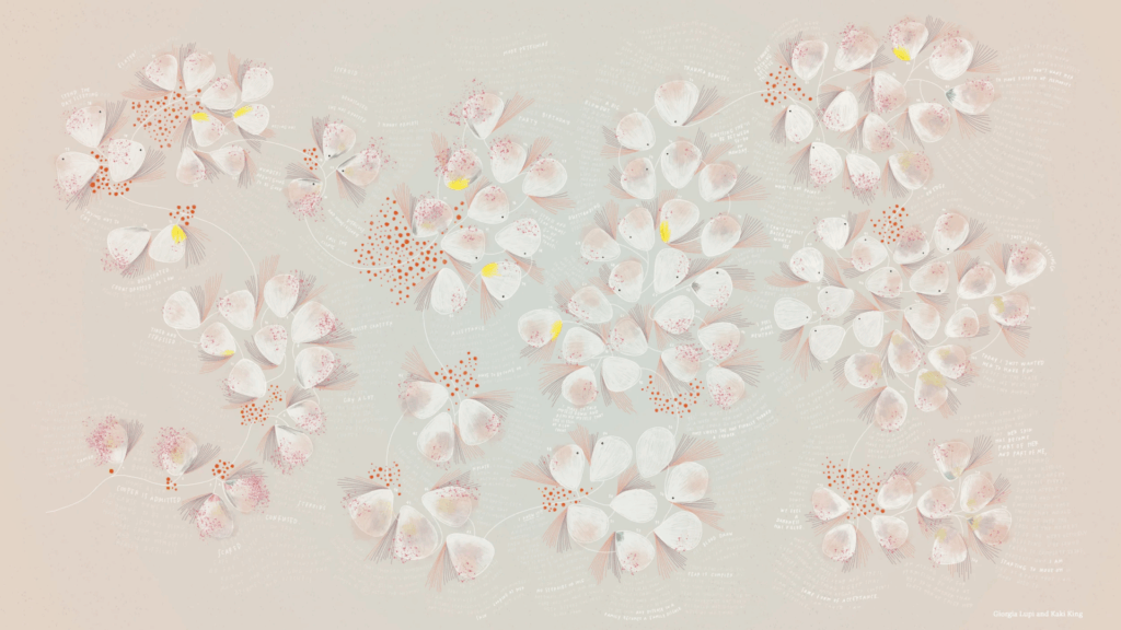
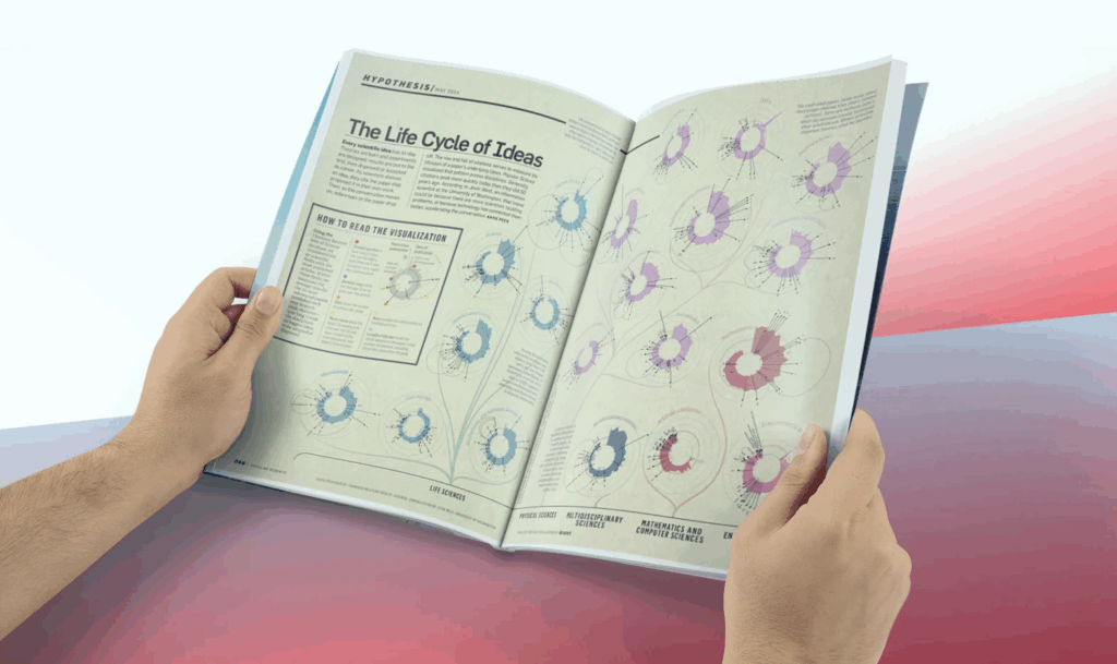
Giorgia Lupi is a humanistic information designer who founded her own data-driven design firm called Accurat. I chose Giorgia Lupi because of her similarly eye-catching and beautifully elegant infographics. Her portfolio contains a large variety of design styles, most of which center around data of humans, art, and music. Some of her work is also physical sculptures or art pieces which is a unique characteristic. Some of Lupi’s work is related to that of D’Efilippo in a visual sense because they both have projects that use floral and other unique shapes to display information, and they both have a number of designs that are focused on data collected on the topics of human activity and historical events or timelines.