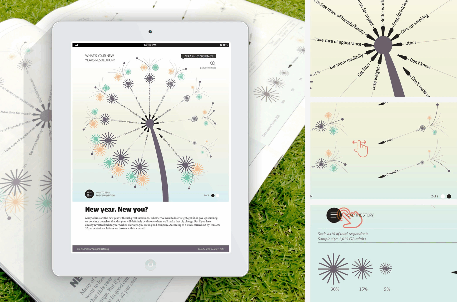
New Year, New You? – Valentina D’Efilippo
I chose this specific work, “New Year, New You?”. This infographic, commissioned by BBC Focus Magazine, illustrates the findings of a study carried out by YouGov about New Year’s resolutions – how long, on average do they last before they are broken and what do we wish the most? This piece of work stood out to me because of how creative the format is – turning a new year’s “wish” into a physical dandelion. This work feels similar to her established style as it has wispy and thin lines that feel interactive, even though it lives in a 2D space. I also enjoy how much varying information she was able to fit in such a small amount of space. She was able to include specific wishes, time lengths, shared genders, total responses, ages, and scale % of total respondents all within a single strand of dandelion. Similar to her other pieces, this one has a simple color scheme that helps to illustrate the whimsicalness of it. The work itself flows in a natural yet informative way that I can easily read. Even though the colors are more muted and pastel, it creates a soft and gentle feel that pairs well with the “wish” narrative. The shapes she uses easily represents a dandelion strand, while still presenting information in a fun and creative way.
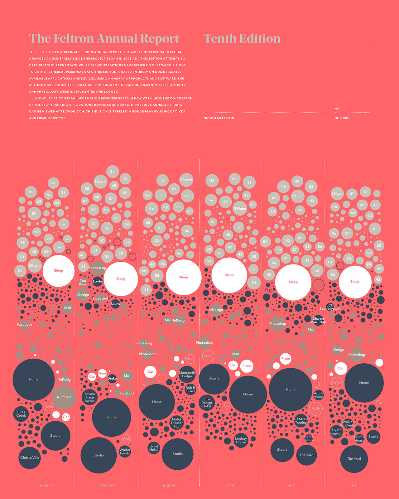

The Feltron Annual Report 2014 – Nicholas Felton
I chose the designer Nicholas Felton, specifically his work “Feltron Annual Report”. He is the author of numerous personal annual reports that condense the events of a year into a tapestry of maps, graphs and statistics. He was one of the lead designers of Facebook’s timeline and is the co-creator of both Reporter for iPhone and Daytum.com. Similar to D’Efilippo, a lot of his work seems to tie into his own personal life in a dense, but well-organized layout. I chose this work because of his personal touch but also because of the bold use of colors and shapes. He was able to take random statistics throughout his year and apply them to a well designed infographic – which is very impressive. His work reminds me of the flow of D’Efilippo’s illustrations. Both designers also use typographic clarity: each data chart or module uses clean labels, numbers, grids, etc; so even though there are many data types, they remain legible. Feltron and D’Efilippo both utilize clean and bold formats to help convey a large amount of information within a single page.