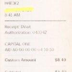
What is a receipt?
The word “receipt” comes from the Old Norman French word for recipe and the Latin word to receive. A receipt is “A written acknowledgment that a specified article or sum of money has been received.” More precisely, receipts contain two main elements, the clearance of goods or services and the settlement of payment. There is no set form for a receipt, though receipts often contain the details of payment and transaction such as a list of goods and services provided, cost of those individual goods, the tax on those goods, the total prior to tax, and the full total after tax. Receipts often contain the name of the seller or vendor along with the vendor’s address.
— Excerpted from “The History of Receipts”
https://www.itemize.com/2015/05/the-history-of-receipts/
The Definition of the Word Receipt
https://www.merriam-webster.com/dictionary/receipt
The First Receipts
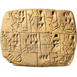
Check out this great video about Cuneiform
That video came from this page. Read it!
https://www.shoeboxed.com/blog/the-history-of-the-receipt
Read about receipts and their history.
Do your own research beyond this list.
https://numismatics.org/pocketchange/receipts/
https://www.boredpanda.com/interesting-receipts/
CVS Receipts Are Ridiculous…
Write a Post about Receipts
- What stood out to you in the readings about them?
- Talk about your personal experience with them.
- Find another link (not on this page) about receipts that you find fascinating
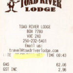
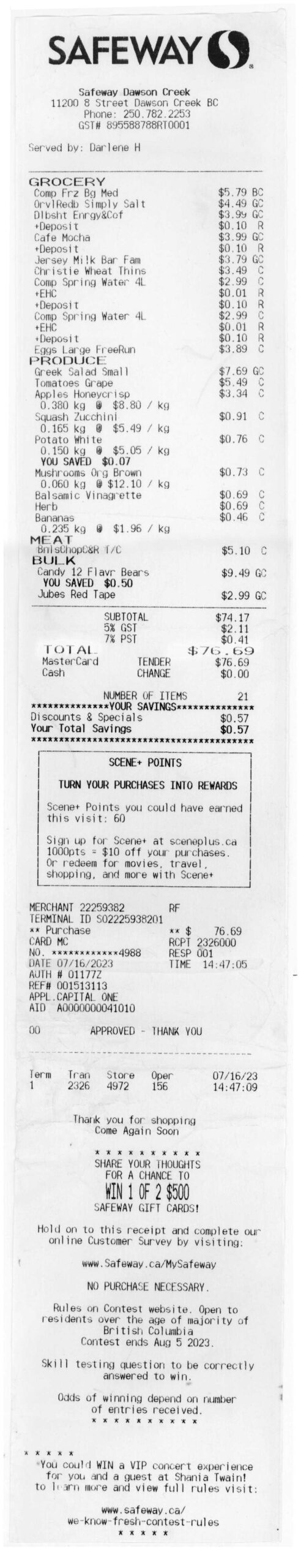
Collect Receipts.
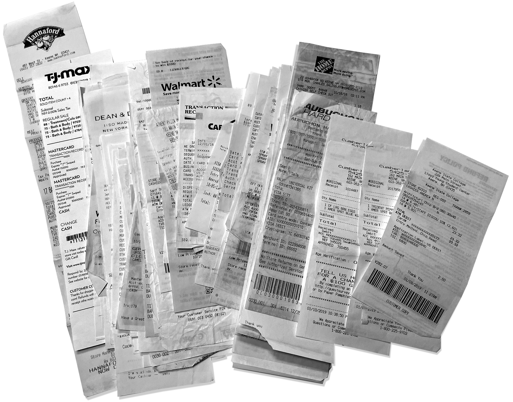
Collect 3 receipts with 4-7 items on them. Do not find them all at the same or similar stores. Try a variety retail, restaurant, convenience, etc. Scan them and upload them to dropbox. Bring the artifacts to class. We will be making posters with the text on them.
A Good Number of Items is 5-10
Not enough items
Way too many items
Buy stuff
Get Receipts
- Go out into the world and buy 4-7 things.
- Ask for receipts and keep them.
- Do this 3 times at three different places
- Scan the receipts at 300dpi
- Adjust contrast and clean up if necessary
- Upload the receipts as separate .PNGs to DropBox
- Bring the receipts to class
Folder name: 01 RECEIPT
Subfolder: Receipt Scans
Due Wednesday, August 27
01
Avatar Reboot
02
Set up DropBox
03
At least 3 Receipts scanned, cleaned up, and on DropBox
Folder: 01 Receipt / Receipt Scans
04
Receipt Post
- What stood out to you in the readings about them?
- Talk about your personal experience with them.
- Find another link (not on this page) about receipts that you find fascinating
Due Wednesday, September 3
01
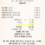
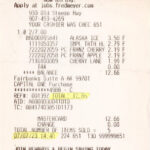
Transcribe the Receipt
This is essential for the workshop today
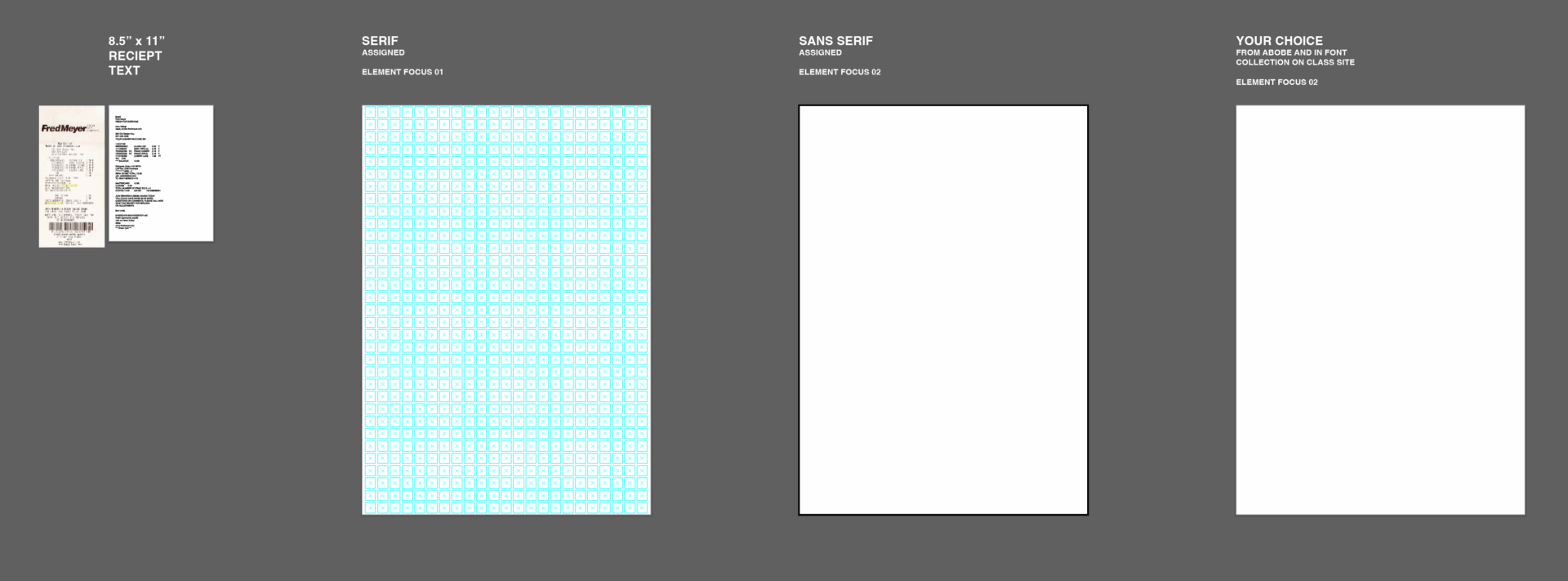
- Type your receipt into a textbox in an 8.5 x 11″ page in an Illustrator File. Use Helvetica Neue Regular.
- Upload the AI file to your 02 Receipt folder on DropBox
- Filename: lastname_receipt_text.ai
Tutorial
02
Receipt Analysis
Instructions on linked page…
03
Typographic Hiearchy Post
Monday, September 8
Create Three Poster Concepts
Using all of the text on the receipt, create an expressive poster in black and white using a limited number of type sizes. Use only typography re-imagine the design and typographic hierarchy of your receipt. Use the assigned and chosen typefaces. Use only one typeface per poster, but you may use several fonts (weights/styles) of one typeface. You may set the type in different sizes but be careful to change type size/weight/style only to differentiate information.
What are your posters about?
Which Elements do you focus on?
Date/Items/Cost/Slogan/cashier/payment/etc ?
Things to consider
- What is you poster about? What story does it tell? How does it comment on the consumer experience?
- Is all the receipt content on the poster?
- What is the the big read, the middle read, and the close read? Does the poster reward the viewer?
What is the largest text (title) and how does the second largest type (sub-title) support and elaborate on the concept? - What are your groupings of text? Are they thematic or are they less meaningful?
- How are you using the negative (white) space? Is it activated? Filled? Trapped?
- How does your eye move through the design? Where are the dead spots?
- Is it dramatic and engaging? Is it beautiful and why?
- Does the poster inspire joy in the viewer?
The Three Distances of Poster Design
-
- The “3-meter” distance (The hook): From about 10-15 feet away, a person should be able to read your poster’s main headline and grasp its core topic. This is the first impression that draws people in, so the title should be large, clear, and compelling.
- The “1.5-meter” distance (The overview): At about 5 feet away, a viewer should be able to read your main subheadings and see the key graphics. At this range, they should get a clear sense of your poster’s structure and the main points of your research.
- The “1-meter” distance (The details): From just a few feet away, the viewer can read the body text, examine figures and captions, and absorb all the details of your work. This is the distance for in-depth engagement, usually while the presenter is speaking.
What you stress in the design creates a story about what the poster is about. Choose a less obvious piece of information and make it the focus such as the credit card number, a particular item, the cashiers name, an obscure code, etc.
Receipt Focus Elements
- Store name / number
- Address
- Staff name
- Credit card information
- Product names
- Prices
- Totals
- Tax
- Store Sections
- Lines and boxes
- Time / Date
- Number of Items
- Return Policy
- Promotions
- A strange mysterious detail?
- etc.
“There are three responses to a piece of design—yes, no, and WOW! Wow is the one to aim for.” — Milton Glaser
Make a Grid for Each Poster
There are many ways to make a grid. Here are three:
- Make a modular grid of consistent rectangles. Leave a 1 pica space in between them.
- Process Grid: Start you poster. Put a number of larger type elements on the page, but not all of them. Drag lines from the rulers to align with your elements vertically and horizontally. Build out the grid from there.
- Random Grid: Randomly drag 10-12 horizontal and vertical lines into the page. Place a second line 1 pica away from each line. Start your poster.
Grid Reading
Parameters
Template
LASTNAME_RECEIPT_V1.ai
Dimensions: A1 (594 x 841 mm) vertical
Color: black & white (for now)
Typefaces: One family per design (but you may use several weights/styles)
Project Parameters
- Text cannot be repeated or repeated and reflected, however.
- All text must be used
- One typeface but you may use different fonts of that typeface
- The posters are about typography
- Dod not use imagery or make imagery from the type
- The message concept should make the familiar unfamiliar
Fonts for Project
These are the only typefaces to be used for this project. Use only one typeface per poster concept. You may use multiple weights and styles.
Due Monday, September 8
- Read and Respond to Grid Reading
- Research Receipts. Start with links above and on your own.
- Print three designs with crops and bleeds “fit to page” on 11 x 17“
- Trim carefully and bring to class.
- Upload Poster PDF on your DropBox in: 01 Receipt/lastname_reciept_V1.pdf
Wednesday, September 10
Receipt Poster Progress
-
Create an entirely new one poster concept
-
Choose one poster you have already to carry forward.
Make revisions based on feedback.
Rules for Posters moving forward
Poster must use different typefaces, layouts and concepts
-
- Two Colors only: (black + one hue or two hues. You man use tints of both colors.
- Use just typeface. You may use multiple (minimal) weights and styles.
- Use typefaces on the classic typefaces page. Try the archive of desktop fonts at the bottom of the page too.
- Use a limited type hierarchy: S / M / L / LX.
- No Repetition of receipt elements (unless it appears more than once on the receipt).
- You must use all characters in the receipt.
- The poster must have a message, it does not have to be a novel but should speak to some idea.
- You may use opacity for productive effect (not arbitrarily)
Class Demo: Full Scale Comps
Monday, September 15
Two posters printed and trimmed
If they use color, print them in color
The color must activate the poster
If not then why use color?
Revise your two posters based on what you have seen in class and to clarify the story and typographic hierarchy.
- Explore different focus, typeface and narrative for each.
- BIG PRINTS will charge a reduced $5 for large format.
- Please have them trimmed BEFORE class.
02
Printed posters
- One Revised poster Printed in Color
- Print the revised other one on 11 x 17.
This can be tiled and taped or printed whole on the big printer. Please have it trimmed BEFORE class.
Monday, September 22
Final Crit
- Final Two Posters Printed at full scale and trimmed.
- Hang on the hallway walls before class.