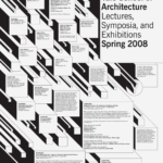
What are the primary and secondary hooks?/ what do we see first and second?
The primary hook is the black drop shadows from the boxes and the secondary hook is the large bold text in the biggest box.
Count the levels of type. / Size / Weight / italics
There are 3 levels of type. The primary level is the large bold type, the secondary level is the large regular type, the tertiary level of type is the small bold/bold uppercase type, and the other level is the small regualr type.
Discuss how it navigates. / eye travels without getting stuck
When I look at this poster my eyes are drawn to the primary level of type by its size and also by the direction of the drop shadow on all the boxes. My eyes them float around to the smaller type in the smaller boxes based on their size.
What aspect of it creates energy? / Design is exciting to view
The drop shadow on the boxes creates energy in this poster. There is lots of movement in this poster that is also created by the drop shadow of the boxes. The white faces of the boxes also create energy because they are all different sizes and cause your eyes to bounce around.
How does it handle white space? / effective structural space
This poster uses white space very well. The white faces of the boxes serve as a place for the information of the poster to sit as well as adding dimention to make the boxes appear 3D.
What makes it work? / overall impression and how it achieves impact
What makes this poster work is how the levels of type hierarchy and the directional motion of the boxes draw your eyes in. This poster is very hard to not look at becuase there is so much motion that keeps drawing your eyes back to the right largest box. From there the different sizes of the other boxes cary your eyes through the poster along with the negative space that is drawing your eyes up to the top right.