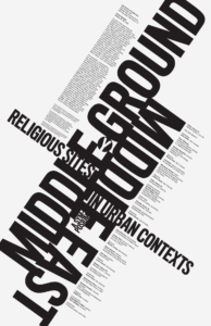
What are the primary and secondary hooks?
What we can see first is the large test that are crossing each other at an angle. The first is “Middle Ground” and the upside down word that says “Middle East.” The second thing that is eye catching is the words, “Religious Sites,” then, “In Urban Contexts” that squeeze themselves in the gaps of the two main words.
Count the levels of type.
In this poster I am able to spot 6 different levels of type which are:
01 Primary Level
- Large, Uppercase, Bold
- Medium, Uppercase, Bold
- Medium, Uppercase, Bold, white with a black circle around it.
02 Secondary Level
- Small, Uppercase, Bold
03 Tertiary Level
- Tiny, Bold, lowercase
- Tiny, regular, lowercase.
Discuss how it navigates:
While viewing the poster, the size of the poster breaks it down smaller and smaller as you read more. It felt almost as if you need to move your head or the poster side to side to read it. Tilt your head one way and you can read the first section. To get to the next section you must tilt your head the other way. You head is able to stop moving side to side once you read the main text of the poster.
What aspect of it creates energy?
The energy of the poster is mostly created by using diagonal angles and fitting into crammed areas. The space of the poster is made to be very clustered in the center of the poster. The energy gives a bit of a slashing and cutting feeling yet also a sinking in the center type of feeling. Almost like the words are spinning and falling into a sinkhole.
How does it handle white space?
Looking at the poster, theres a lot of whitespace surrounding it. It feels like white space is perfect square corners poking into it as the type is so well structured to create that shape. Not much white space is used in the center other than the gaps in the type. In some gaps between letters theres words poking in and squeezing through to fill in some space.
What makes it work?
What makes this poster work is certainly the strong typography, the boldness is very eye catching. I believe a strong element is the structure where you do sort of need to move your head side to side to create that flow when you read. The idea that it’s all conjoined into one area while all words are still readable creates a bold look to it. One of my favorite parts is that use of white space as perfect corners are created from it. It’s almost as that white space is being used to create a shape.