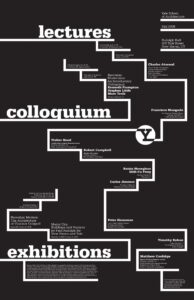
What are the primary and secondary hooks? /What do we see first and second?
The primary hook is the words lectures, colloquium, exhibitions, and the letter y inside of a circle with inverted colors.
The secondary is located above in the top right corner; the school’s name, as well as the year and address, are provided for the viewer.
Count the levels of type. /Size/Weight/italics
There are 5 levels of type
Large type, extra bold, all lowercase
Medium-large type, bold, title case
Medium type, title case
small type, title case
footnote type, sentence case
Discuss how it navigates. / eye travels without getting stuck
The eye draws you to the title, drawing you up and down the page. Immediately, upon a second scan, I can see the hosts of these lectures and talks all arranged in a grid that naturally casts down, as if you are going down a flight of stairs with your eyes. The more in-depth information gets smaller as you go through the different events. At the top right, you see some important information that is clearly separated from the rest, highlighting its significance.
What aspect of it creates energy? / Design is exciting to view
As I mentioned before, it feels as if you are traveling through the poster with the grid that organizes every event by title, all connected by the Y that represents the school.
How does it handle white space? / effective structural space
I think it handles space very well. It does have space, but the space feels natural. It has just enough going on to not get you overwhelmed, but instead engaged.
What makes it work? / overall impression and how it achieves impact
The lines on the poster almost create a natural zig-zag structure for your eye to follow. It does well at drawing you in with the unique structure, and it makes me genuinely interested in these events.