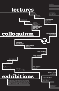
What are the primary and secondary hooks?
The primary hooks on this poster are the words “lectures”, “colloquium”, and “exhibitions”. The secondary hook appears to be the letter “Y” that is inverted inside of a white circle. The white lines that move throughout the poster caught my eye early on as well, but require more attention and time to understand their purpose.
Count the levels of type.
I counted what appears to be five distinct levels of type:
- Large type, bold, lowercase
- Regular type, title-case
- Regular type, bold, title-case
- Small type, bold, title-case
- Small type, regular weight, title-case
Discuss how it navigates.
I chose to analyze this poster because of how easily my eyes navigated it. At first glance, we see the three words and letter “Y” in the largest text, bolded for emphasis. From there, one might naturally navigate up to the upper right corner, where information about the school is separated into three sections of regular weight type. The bold, white lines throughout the entire poster help your eyes navigate the small type, separating each section almost like a staircase. They help communicate to the viewer when to stop and read the information before moving to the next section.
What aspect of it creates energy?
The stair-like lines that span the entire poster give it a lot of movement and energy while ensuring that the information is easy to navigate and digest section by section. The small type forces viewers to engage with the poster closely, emphasizing each section of text as our eyes naturally move down the page, from the very top to the very bottom.
How does it handle white space?
This poster has a successful amount of white space while still having its contents span all four sides of the page. There are only four instances of large, bold type, and while the rest is much smaller, there are enough sections of small type that the poster feels full and complete without being overwhelming and difficult to navigate.
What makes it work?
I think a big part of what makes this poster work is the black and white color scheme, which allows us to see the type hierarchy more clearly. There is a clear structure throughout the whole poster, making it visually intriguing and easily understandable. The large type reveals just enough about the rest of the poster to make viewers interested and want to engage with it, and there information all throughout the page which makes it so that we do not get bored with it halfway through the interaction.