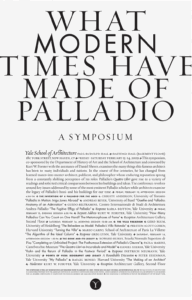
- What are the primary and secondary hooks?/ what do we see first and second?
“Modern” and “Times” stick out first to me. Modern is in its own typeface making it stand out and times makes me think of Times New Roman.
- Count the levels of type. / Size / Weight / italics
There’s (about) 6 from a size level. The title, the heading, the opening line, headers, body text, and the bottom text. You could argue that the Y below it all is it’s own, but its the same as in Symposium.
When considering weight and italics, there too many. I’m not counting them all. They’re part of the body.
- Discuss how it navigates. / eye travels without getting stuck
It’s built like an article; a very readable top to bottom, left to right.
- What aspect of it creates energy? / Design is exciting to view
It’s a very wild piece contained within strict rules. The shapes and spaces are very meticulous and defined, but within that space, the type gets to go crazy with different weights and typefaces.
- How does it handle white space? / effective structural space
The white space keeps the piece deceptively simple. The type is all the decoration it needs. If a space is blank, it gets to be blank.
- What makes it work? / overall impression and how it achieves impact
It works really well for being to simple at first glance. I don’t get scared away by all the words, so I actually go in to read it. After that, I get to notice all the fun type treatments within.