These two works resonated the most for me. I like how they both have a dark background and an accent color with light text, it is has a very strong contrast that really draw tour eyes in.
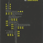
The first one is by Trace Byrd and I think that the grid is amazing! I like how everything is going in different directions, but is still so unified at the same time. The text all together also makes a unique shape that I really enjoy.
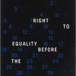
The second is by Devon Burgoyne and I also really like this grid. It seems like the numbers are scattered around randomly, but they are actually perfectly in line with themselves and the grid!
In this reading I learned that grids can take many forms and are used in almost every piece of publication design. I didn’t know that grids could be circular or diagonal, in my head I always imagined them like graph paper and that there were no other ways for them to look. I also never put much thought into how the colums of text in textbooks and magazines are grids, even though that seems sort of obvious.
An aspect of this reading that I will be trying in my posters is using an unconventional grid! Now that I know a grid doesnt just have to be squares I think I want to try one with diagonal grid lines.