After reading about the art of grids, I realized that something I often implement in my own work is creating consistent margins and columns wherever necessary. This is something that I had not considered to be associated with grids, but now it is clear how closely related the two are. White space also plays a big role within grids. The spots on a poster that appear to be empty are spaces that are able to be activated because of the grid. It encourages us to leave those spaces empty instead of trying to activate every part with content, which can make it feel too full and overwhelming. Grids allow us to make use of the entire surface of our designs, making every part from the center to the corners activated and important. We can use grids in such a way that they appear to be irregular and have an arbitrary feel to them while still being aligned, and depending on the way that the content interacts with the grid, it can become visible without actually being there. It is also interesting to consider how grids are everywhere in our daily lives, from modern architecture to the layout of the streets we drive on. Even sites like Google and Pinterest rely on a grid structure to make user experience easy and understandable.
There are a few aspects from the reading that I will try to apply to my receipt posters, including the use of white space as an active element. I am anticipating facing some difficulty in arranging all of the text on my poster since there is so much of it, but the use of a grid will help me organize it in such a way that includes different sizes of type while still being aligned with one another. I am looking forward to experimenting with an irregular grid to create a dynamic visual that is carefully planned out and not arbitrary.
-
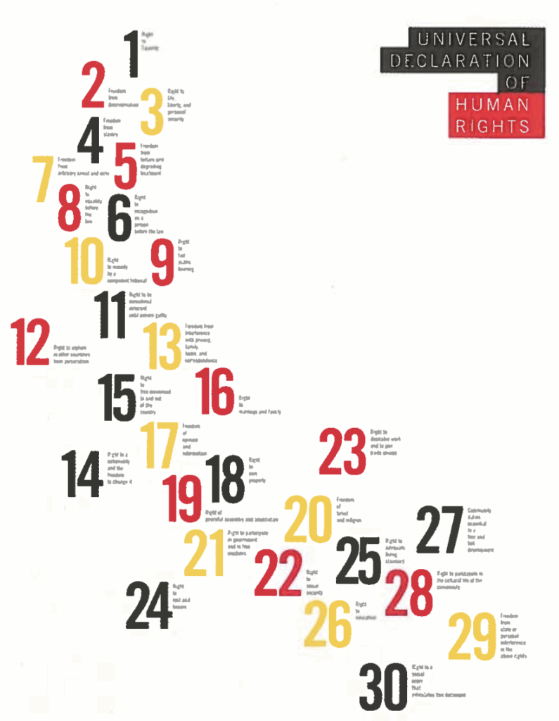
- I was drawn to this poster because in the reading, it is shown that it was built upon a simple, strict grid, but the final product appears to be completely random. There is also a strong use of white space that is effective in making the whole poster feel activated without being too crowded with content.
-
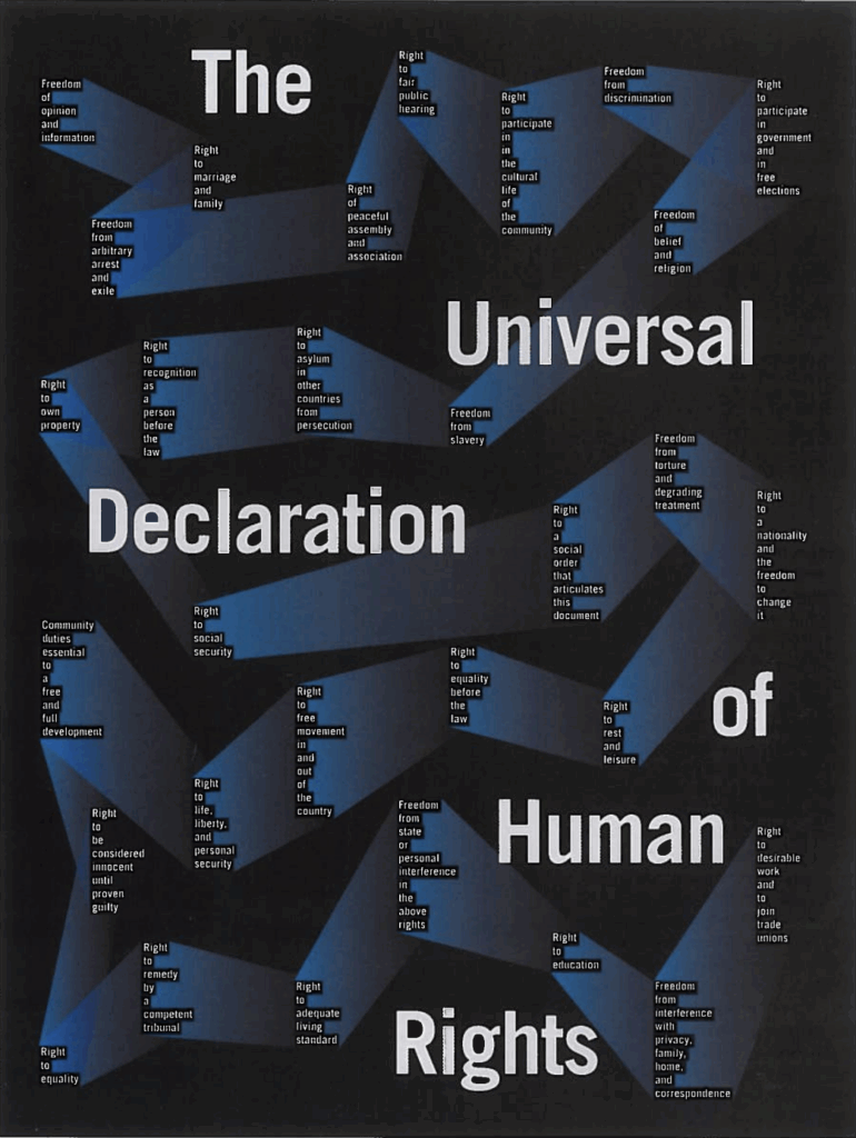
- This poster is particularly interesting to me because it is clear that the text, especially the small sections, are aligned with one another, but the large text appears more arbitrary. The shapes behind all of the small text creates a lot of movement within the poster, giving our eyes the choice to follow the grid or bounce around with the shapes.