Which works resonate from the reading? Include a screen snap.
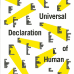
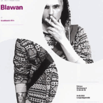
The two images above are the ones that resonated with me most. With the one on the left, the balance of vertical and horizontal type working together is something I’ve never seen done so well before. The text is the United Nations Universal Declaration of Human Rights, which includes three other variations of the same poster showing the diversity of the design, and as a designer, how many ways you can execute a good design based on a single concept or piece of type. The second image is simple yet impactful. The technique described in the textbook is described as rhythm, form, and frame. The use of a grid may seem simple at first glance, but there is more that goes behind this piece. These complex forms intrigue the eye, such as using shape as a shape and framing tool. The image is spliced uniquely; even though the image is disconnected, it still feels connected by the way they line up with one another.
What did you discover about grids that you did not know?
I never knew grids could be used in specific ways. For example, depending on the designer or project, you can use grids in either a strict way or in a way that is not as constricting, such as constructing your grid around a design as you move forward with it. I also appreciate how this reading is suitable for beginners as well as a refresher for those who need a review of grids.
What aspects of this reading could apply to how you take on your posters?
I hope to incorporate a clever grid that ties the design together according to my vision. I want the poster to feel personal yet robotic, after looking at receipts for so long, that is how they feel to me, and I want that to be shown in my work. I am so excited to make something with just type. Something this restrictive can also make it more enjoyable in a lot of ways. I look forward to not only following the rules in the reading and taking notes from them, but also breaking them.