-
Which works resonate from the reading?
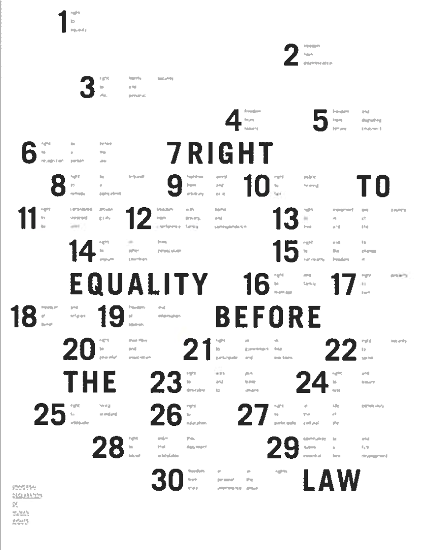
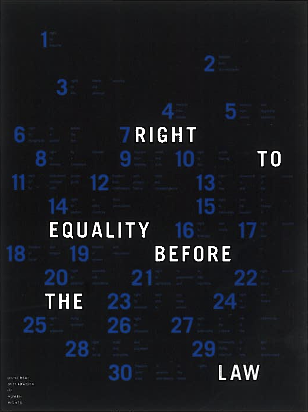
I resonated most with the two posters shown, designed by Devon Burgoyne. I was most intrigued by the layout of information shown in the grid. In this example, I find it is very clear where the grid is, and follow it in a very strong manner. There are no assumptions when finding the grid. However, the order in which the information lies is what caught my eye. Obviously, it is in numerical order, but the numbers are seemingly scrambled over the poster. Is there a reason for the separations? Is it to increase visual interest or just to emphasize the grid? Does it represent something? All are questions raised just by examining a simple grid.
.
.
-
What did you discover about the grids that you did not know?
Something I discovered about grids, which had never occurred to me, is the influence web design has had on print design. “The utilitarian density of the web has influenced the design for print.” I find this to be very clear when I look for inspiration, and now notice how the more editorial/contemporary layout designs reflect technology and web design.
- What aspects of this reading could apply to how you take on your posters?
I could apply a lot of the information I learned in this reading to my posters. Especially since the posters are designed around grids entirely. Mostly, I plan to keep notes of utilitarian design and see how the grids I use reflect in the bodies of text, and try to visualize what I desire the poster to mean. Instead of just using a grid as a tool, I want to use it with meaning and understanding. The grid is a leading element of the poster, not just something used as a reference point.