![]()
Which works resonate from the reading?
For me one of the ones that resonated the most as the grid reading about websites. While I love print and I’m interested in the craft of print I also wonder where can things that we’re doing in class be translated into a fluid website style. The market in terms of jobs is shifting significantly towards digital works so what I started to wonder was how could these posters translate to a digital grid. What would they start to look like? How could you create a system that always crates a meaningful structure of type?
What did you discover about grids that you did not know?
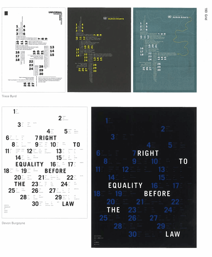
This is something that I already kind of knew, but was further reinforced in this reading. That being just how flexible and universal a grid can be. It’s driven home in the united nations universal rights posters. They have grids that not only abstract information but portray it in a beautiful way. And another little tidbit that I already kind of had an idea about but was further driven home was that designers can adhere to a grid, but also break out of it when necessary to further drive home a point.
What aspects of this reading could apply to ho you take on your posters?
I think just using a grid as an underlying structure in the first place, I have designed with columns in the past but have always found it kind of hard to design with a grid. So my big takeaway as trying out grid maybe seeing what can work for me to create a poster that follows the rules but also breaks out if it when necessary. How do I design on a grid but also not make it look like it is rigidly sticking to a grid.