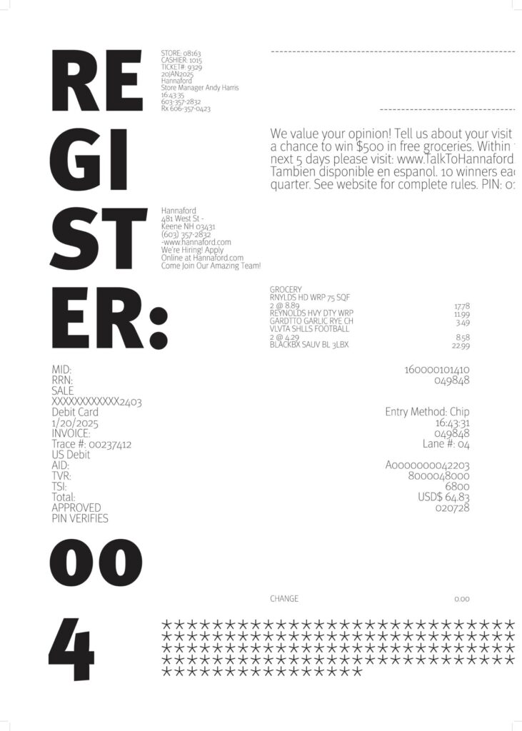
Continuity: My poster exercises continuity by displaying text along the invisible grid, which creates the visual of the blocks of text following distinct, continuous paths down the poster. There are four lines of vertical continuity here, guiding our eyes down one column at a time. However, the information in each column is not necessarily related, which I realize now may be disrupting the overall story and ability to make sense of the information.
Figure/ground: Figure/ground is at play in my poster in the sense that there is a distinct difference between the biggest piece of type and all of the rest. There is emphasis on “REGISTER: 004” because of its size and weight, and the rest of the type falls into the background to support it and provide context.
Proximity: My poster exercises proximity by having blocks of text that are closely grouped together and separated from the others. For example, all of the grocery information is in one group and so is the store information, which makes it easier to understand each group of type and put them all together to complete the story. The lack of proximity of each of the groups of text also creates movement.
After this exercise, I feel as though my poster needs a lot more work to ensure that more of these principles are being effectively utilized. There is not much hierarchy at play in this poster, as there is really only about three distinct levels of type. The highest level is supported in terms of context by the rest of the type throughout the poster. I feel as though I should push the small text to be even smaller which will create more contrast. I would also like to rearrange the blocks of type to better inform viewers on the story, because the information is scattered and out of order in this current version, and the lack of hierarchy puts everything on the same level which fails to communicate which groups should be read first after the main piece of type.