Top three Gestalt Principles:
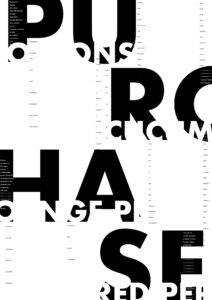
Pragnanz – My poster has several words that use negative white space within the large black text, this creates the outline that there are words going across each set of two large letters. By having those white-space letters large enough and placed properly, it creates an easier way to read the whole word even if it’s not all there.
Figure/ground- The use of figure/ground is at play with my poster as I was able to create a distinctive hierarchy with the type that catches the viewers eye. With the use the largest hierarchy letters “PURCHASE” I was able to create a secondary hierarchy with 4 words that are created by having white text within the “PURCHASE”. The shape of each letter is distinctive enough that the viewer can also easily shift focus to the secondary text.
Symmetry and Order – my poster has a grid system that aligns many of the smaller texts with the largest, whether it is placing the text along the very bottom of each large letter, or having it aligned with the verticals. The zig-zag like system I created with the large text, also creates a grid that is repeated.
The hierarchy of information starts with the focus on “PURCHASE” which has been broken up and enlarged to draw viewers in. Upon a second glance the secondary information of the 4 items within “PURCHASE” makes the viewer pause to decipher each word. As they do, the viewer is able to notice the tertiary information that is within those large letters as well, finally the viewer can get close enough to read the smallest text that takes space in the negative white spaces.
