Gender Wage Gap Viz
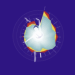
I chose this infographic because it caught my eye. At first glance, I thought it would be a statistic about dance, so I was surprised to see it was about the gender wage gap. This infographic made me feel shocked by how large the gap is in some countries, even in the U.S.! It made me think about the wage gap more because seeing it visualized made it so much easier to process than just reading an article about it, so I paid more attention.
This infographic created insight by making this information easily digestible. Instead of having a long article filled with graphs and charts, it’s been simplified, but still manages to relay lots of information!
The formal choices that make this work are the colors and the layout. There are 3 different categories of data: high wage, medium wage, and low wage. Because they are each represented by a different color, you can view them all at once, making it easy to see the trends of all the data. The layout is also very intuitive because the names of the countries are visible, but also add to the overall circular shape of the graphic.
Nicholas Felton
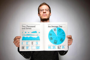
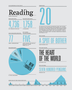
Nicholas Felton is an infographic designer and was also a member of the product design team for Facebook. I chose Nicholas Felton because his subject of work reminded me of the survey we had to take for class. He makes infographic books called the Feltron Reports about the stats for each year of his life. In class, the survey we took was similar to what he does all year, and I thought that was really intriguing and also a lot of work!
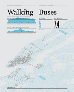
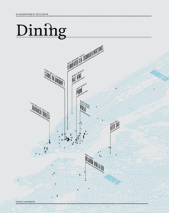
My favorite of his works is the Feltron 2007 Annual Report . I like the consistent color scheme and the variation of the graphics. My favorite pages are the ones where he uses maps to track where he eats and where he walks.
Nicholas Felton relates to Valentina D’Efilippo because they both design infographics. I think that Valentina D’Efilippo’s designs differ from Nicholas Felton’s in their content. Valentina D’Efilippo uses data from the world to bring light to things going on (war, wage gap, game noise), as Nicholas Felton uses his own personal life for data. They both use graphics in a unique way to make information easier to digest!