Valentina’s Trending Seeds for the “Me Too” movement is a very creative and unique way of showing data – as was all of her work. What I liked about this work was how the whole page interacted/moved and not just the main dandelion imagery. Visually it was kind on the eyes, using the teals and shades of purple to color-code specific pieces of information. I liked how as you scrolled the page, it broke down specific key points in the data, such as the tweet that started the movement. I think this was a strong move as it allows viewers to get a better understanding of the work before scrolling back to the top to look at all of the individual tweets in the dandelion. I appreciate this choice, along with the choice to have each dandelion “petal” be interactive when you hover over it; it helps the viewer, like myself, not get overwhelmed by information.

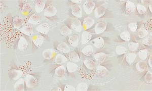
A second designer I chose that reminded me of Valentina D’Efilippo and her work is Giorgia Lupi. Lupi is a data designer that designs engaging visual narratives with print, digital and environmental medias that create new insight of people, ideas and organizations. I was exploring Lupi’s website and her specific piece “BRUISES – The Data We Don’t See” caught my attention. In this piece she took music and art to communicate the information of the impact the illness of a child has on a family, that clinical records are unable to capture. The data collected was the daily occurrences and habits of one of a friend’s child going through Idiopathic Thrombocytopenic Purpura (ITP). Lupi’s friend was a musician and the two collaborated to collect data and structured a fluid timeline that recorded daily moments and the families experiences. This piece stuck out to me similarly to how D’Efilippo’s “Trending Seeds” had with a calming visual use of colors and imagery of a flower, to portray the data of a topic as impactful and negative as abuse and illness.
BRUISES – The Data We Don’t See