Poppy Field
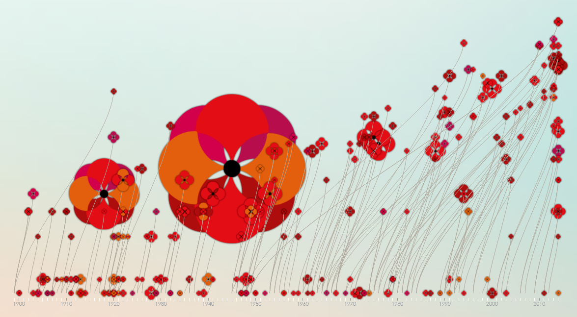
I chose the Poppy Field infographic to look deeper into. I thought it was very clever to show both the number of deaths with the size of the poppy and the length of the conflict using the poppy’s stem. As she mentions in the initial paragraph before the infographic itself, the poppy she uses is a symbol of of commemoration and the red evokes bloodshed. I think both that and her using the size of the poppies to show the number of deaths are part of what makes this infographic work so well. The huge poppy for World War II really stands out and makes it clear just how many people died, and the number of poppies overall is also pretty horrifying.
Giorgia Lupi


I chose Giorgia Lupi because her work Happy Data caught my eye, both because of the style and because of the content. Style wise, I really like hand-drawn/handwritten things, and content wise I think it’s incredibly important to seek out the positive news, especially these days when most of it is negative. Upon looking further into Lupi’s work, I really enjoy her style in general – her designs feel very artistic while still succeeding in getting across the information. I think both her and D’Elfilippo have work that feels very visually interesting, that makes you want to look more into it and helps the process of learning information feel more enjoyable.