Valentina D’Efilippo
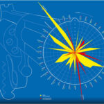
I found this infographic about guns/gun homicides in different countries really interesting and well done. This graphic was created as a part of her book, “The Infographic History of the World.” It depicts a handgun firing, drawn on a blue background in a blueprint style. The blast from the gun creates yellow and red peaks that align radially with countries, listed A-Z on the end of the barrel. In yellow, the statistic shown is guns per 100 people, and in red the statistic is gun homicide rate per 100,000 people. What makes this infographic effective to me is just how clever the idea of it is. Though the way the data is presented is unusual, it is still easy to decipher and understand the information. The primary colors used create great contrast, and the radial grid is satisfying to look at. The graphic commands your attention, showing a blast from a gun and is really able to highlight the severity of the data. The way Valentina creates infographics is so effective and important- she organizes data into a visual experience that engrosses you in the importance of what is being conveyed. A typical bar graph wouldn’t hold as much value.
Eleanor Lutz
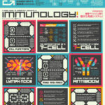

I stumbled upon Eleanor Lutz while poking around the internet looking for information designers. Looking at her work, she specializes in creating medical and space/astronomy infographics. She has a really broad scope of work and a diverse set of styles she works in. Her stuff is super intricate and detailed- and could be studied for hours. This attention to detail is similar to what can be seen in D’Efilipo’s work.