Valentina D’Efilippo
The piece that caught my eye by Valentina was her Gender Wage Gap Viz in which she depicts the data through a chart drawn in the shape of a ballerina’s tutu. She provides different ballerina charts to break the data down, showing the dancers in different poses.
Talk about how it makes you think…
The chart is created in order to visualize the unfair wages being paid to women within a plethora of countries, providing the average wage pay gap as well. Choosing to use a ballerina as a focus for the chart design is inspired, as the job of a ballerina is often considered to be for women.
How does it create insight…
The gender pay gap is a widely-known issue, but visualizing the data helps make it more apparent of how serious the issue is, and where in the world it is the most prevalent. Especially when it comes to the data spike in the country of South Korea, showing this inequality statistic in comparison to other countries highlights the great issue.
What are the formal choices, color, image, type that makes it work…
The contrasting colors as well as the gradients work very well within this design. They seem as though they belong even though the colors are completely different and often clashing when used in other designs. The simplicity of the design makes it seem welcoming to the viewer, even with a topic of such great complexity. The color choice seems to relate to the book that this infographic is placed within. The colors of the cover of this book are the same colors being used in the chart’s design.
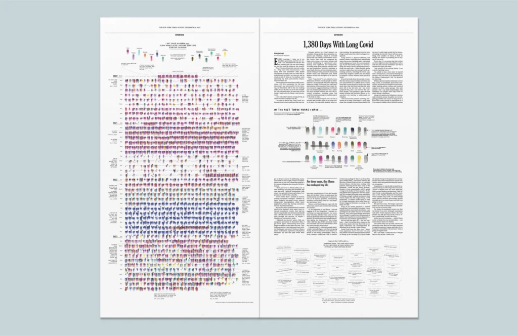
Giorgia Lupi
I found Giorgia through a LARGE collection that a reddit user had made on Github on information designers (referred to as Data Folk”) which lists the designers alphabetically, gives their website, and what kind of informational designer they are. I flipped through a few, but Giorgia caught my eye.
She has created many pieces that are visually stimulating, as well as informative. My favorite are her informational designs that are created completely from scratch using information from her own life. She has created designed denoting her experience with Long Covid, as well as written a book about what makes information design so captivating. She considers herself a “Data Humanist”, using design and data to tell a story.
Her work relates to D’Efilippo by the humanist design aspects, using information to tell a story and make data seem more human. Both designers utilize simplicity and negative space in a way that makes information more digestible. Their designs make people want to look at them, rather than be bored by a large expanse of data.