01
Format:
Vertical
02
Types of Infographics:
- Data visualization
- Timeline
- Comparison
03
Information
Data collection example:
-
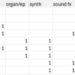
- Screenshot
To collect the data, I listen to a song and mark what instruments I hear throughout. I’ll do this for the top song of every year from 1944 – 2024, or for as many years as I can if this proves too difficult!
04
Titles:
Headline Ideas:
- Instrumentation across time / 80 years of instrumentation
- Sounds of Success
Subhead:
- A visual index of #1 songs across time
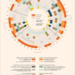
Introduction:
- Each pattern of rings depicts a song’s musical composition. The color of each ring represents the presence of a certain instrument, and the total number of rings show the total number of instruments used. The purpose of this infographic is to compare the most popular songs to each other over time. What do the most popular songs all have in common? How does the appearance of the rings change over time? Are there patterns throughout – is a formula apparent?
05
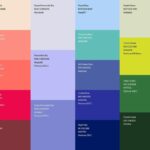
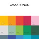
Color schemes:
For my idea, I would have to create a color scheme of 23 colors (for 23 instruments). Similar to the colors in the sketches below, but chosen more intentionally
06
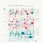
Thumbnails:
-
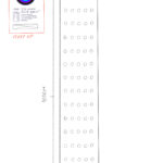
- Full scale
-
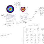
- Close up
07
Inspiration Gallery