My Reaction To Helvetica
After watching the film I began to grow a stronger appreciation for the text font. Helvetica’s history has made a huge impact in graphic design and the world we live in today. Everywhere that you look there is a source of Helvetica typeface. Whether you look at food, logos, books, products or companies helvetica surrounds us. I look at helvetica typeface and appreciate its simplicity. It is clear, precise, and easy to read. The film was interesting to watch and I would give it another watch.
Massimo Vigilenti
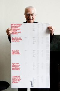
“Life of a designer is a life of fight against the ugliness”
This quote by Vigilenti fascinated me. I find it interesting how the history of font changed from a serif style font to helvetica over the years. Many companies and design products switched to Helvetica since the 19th centuries typeface became ugly. Font is always changing due to peoples perception of ugliness. If the life of a designer is to constantly critique ugliness in a font, how will designers change helvetica when society finds the font ugly?
Work:
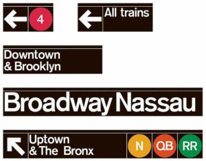

Wim Crouwel

“I am always interested in clarity, it should be clear, it should be readable, it should be straight forward”
I found this quote by Crouwel interesting because it functions similar to news and journalism. When writing articles or scripts for news stories the writer must focus on clarity, similar to graphic design. Graphic design and Helvetica should be easily readable so the person reading the text should only have to view it once. This relates to how news stories should be written in order for the reader to easily read.
Work:
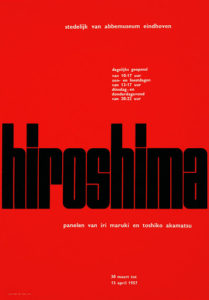
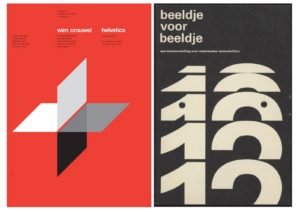
Erik Spiekermann

“Real typeface needs rhythm, it needs contrast, it comes from handwriting”
I found this quote interesting from Spiekermann because he considers helvetica to be basic and feels like its a fake typeface. If real typeface has uniqueness to it why shouldn’t helvetica make the list. Although helvetica is a very basic style of font, it works well due to its simplicity. I find Speikermanns opinion reasonable since he doesn’t enjoy the helvetica typeface and prefers something more unique.
Work:


