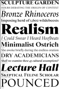
Helvetica; What is it?
When you walk down the street, pick up a magazine, or fill out important forms, helvetica is a font you are bound to see. Helvetica is the latin name of Switzerland, making it known as the Swiss type face. It is a typeface that is everywhere and anywhere. It is used for a variety of advertisements, signs, and more. This font is know for its letters having of a horizontal slicing off of each letter. This font was developed in 1957 by a Swiss Face typer designer named Max Meidinger and Edward Hoffman. It is a neo-grotesque design that is really a cleaner version of an old German font. This font can be used to make designs look professional yet transparent at the same time.
Speaker’s Words
“A designer choosing typeface is equivalent to a casting director.”
-unknown
This quote is short and simple, but it puts into perspective of what a designer’s job is. Sure, a designer’s job is to make things look ‘pretty’ and pleasing, but there is so much more that goes into it than what people think. Relating the job of choosing a typeface for a certain design to a casting director shows how immensely typeface effects how something can look. The typeface must be perfect so as to be visually pleasing and engaging at the same time, and that takes a very keen eye and a lot of talent that people don’t usually associate with graphic design.
“What is’ all about is the interrelationship of the negative shape, the figure ground relationship, the shapes between characters, and within characters…It’s not a letter that’s been bent to shape, it’s a letter that lives in a powerful matrix of surrounding space. Oh, it’s brilliant when it’s done well.”
-Mike Parker
Mike Parker emphasizes the reason Helvetica is so important in daily culture. He explains the significance and science behind the reason why this font is so appealing. Audiences just see a font as a font and nothing more, but the reason they do so is because of the carefully placed spaces and shapes within the letters. This quote explains how Helvetica is unique and the reason why it is used for so many things- professional or transparent.
“Two seperate cultures of design. One was the cooperate culture and the cooperate culture was the visual language of big cooperations. At the time they were persuasivley helvetica…they were clean…I felt like it was some conspiract of my mother’s to make me keep the house clean. That all my messy room adoloescent rebellion was coming back for me in this form of helvetica and I had to overthrow it.”
-Paula Scher
This quote is interesting because Paula explains how helvetica is not her favorite typeface. She believes it is too clean and that it isn’t transparent enough. It doesn’t allow designers to express their creative potential, so she decided to take her own spin on it. I just thought this was interesting because before being introduced to Scher, everyone praised the popular typeface, but this was something different.
Gallery
Massimo Vignelli
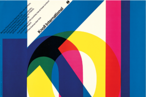
Massimo Vignelli is an Itlaian designer known for working on various pieces of designs for many different types of designs. Many name brands were designed by Vignelli.

Rick Poyner

Rock Proyner is a British writer on design, graphic design, typography, and visual culture.
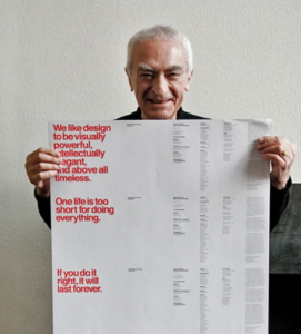
Mike Parker
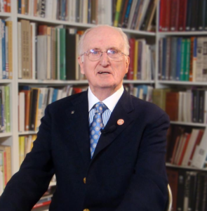
Mike Parker is known for bringing type and typography into the digital era. He oversaw the development and production of thousands of fonts. He was one of the people who were responsible with introducing Helvetica to the United States.