After reading through all of the links that were provided, I decided to compare the typefaces Baskerville and Didot.
Baskerville vs. Didot- Differences
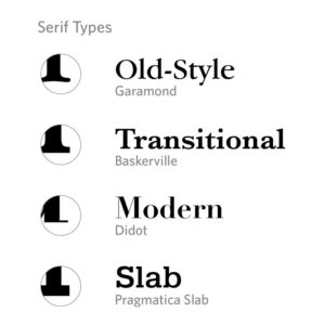
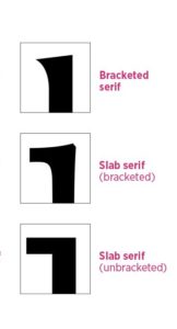
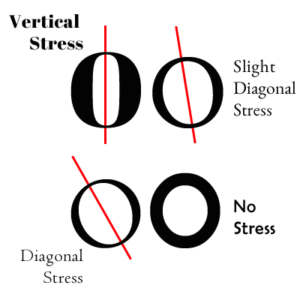
The first biggest difference between these two typefaces is that Baskerville is a Transitional typeface whereas Didot is a Modern typeface. A Transitional typeface forms a bridge between Old Style and Modern typefaces while a Modern typeface can be seen as an new and improved version of Old Style typefaces. Another difference between these two is based on the serifs and their brackets. Brackets are a curved or wedge-like connection between the stem and serif of some fonts. Didot has completely unbracketed serifs and so there is no curved or wedge-like connection while Baskerville just has less heavily bracketed serifs. This means that Baskerville still has brackets on their serifs they are just not as heavy as they are is say Garamond. Finally, these two typefaces are different because of their stresses. Stress in typography describes when an axis of a letter leans left or right which creates positive and negative stress. Old Style typefaces typically have a more inclined axis with Transitional typefaces being more vertical. In the case of Baskerville and Didot, Baskervilles stress is almost vertical while Didots stress is very strongly vertical.
Baskerville vs. Didot- Similarities
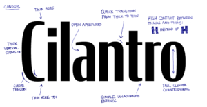
While these typefaces have their differences, they are also similar in a few ways. For one, both typefaces have a strong contrast between thicks and thins. This just means that there is a distinct and noticeable difference between the places that are thick in the letters and the places that are more thin. Another similarity is that both typefaces appear wide. Instead of the letters appearing squished and condensed, the type looks wide which allows both typefaces to be legible and easy to read.
Opinion
Overall, in my opinion. I enjoy reading Baskerville more than Didot. To me it is just more appealing to look at Baskerville. I like that the serifs are bracketed but not too heavily and that the stress is almost vertical but not completely. Baskerville just seems to have a nicer flow to it when my eyes scan across it. I also enjoy that when Englishman John Baskerville created this typeface in 1757, that he made it a Transitional typeface. It is interesting to see how this kind of typeface has the ability to incorporate properties from Old Style typefaces and Moderrn typefaces creating this connection between the two. I certainly agree that it is one of the most pleasant and readable typefaces.