Baskerville vs Helvetica- Differences
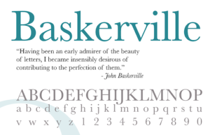
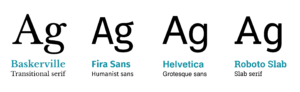
The biggest difference between these two typefaces is that Baskerville is a Transitional typeface and Helvetica is a sans-serif typeface. A transitional typeface is in between a classical typeface an a modern typeface. A sans-serif typeface is considered more of a modern typeface. Another difference between these two typefaces is that Baskerville has serifs and Helvetica has none. Helvetica is more of a bland font. Baskerville is more elegant and has more of a glide when you look at a letter. Helvetica is more blunt and has sharper edges. Helvetica also has more boxy letters. Another difference is that Baskerville uses thin and thick lines, whereas Helvetica is all the same width.
Baskerville vs Helvetica- Similarities
Even though there are many differences between these two fonts there are a few similarities. Both of these typefaces are considered modern in their own ways. The spacing between each of the letters seem to be the same distance apart. Also, both of the fonts have thick lines on their letters.
Baskerville vs Helvetica- Opinion
Overall in my opinion I like Baskerville better because it has more character to it. Helvetica is such a boring font and is used all over the place. I personally like how Baskerville has serifs and is more elegant to read. I also like how Baskerville was created to be a transitional typeface and he used thinner serifs to make it look more appealing on the printing press. I think Helvetica is overhyped and is used in too many places for it to be appealing. I don’t know why someone would chose to type in Helvetica over Baskerville.