Differences- Didot vs Helvetica
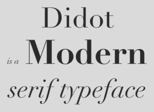
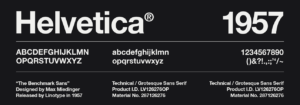
At a quick glance, Didot and Helvetica are clearly quite different due to their overall structure and anatomy. To start with Didot, it has very thin serifs on most of its letters. It also has a very strong vertical stress and distinct thick and thins. For example, Didot’s shoulders tend to be very thin in comparison the rest of the letter. Helvetica on the other hand is the complete opposite. Helvetica is the same width for all of its letters. It also does not have any serifs. Related to Didot, it is a much more blockier typeface. The x-heights are also quite different, as Helvetica has one and Didot does not.
Similarities- Didot vs Helvetica
Despite the many differences between these two typefaces, they do in fact have some similarities. Didot is categorized as a modern typeface. Helvetica can be put in both the modern and traditional typeface categories. However, due to the popular use of Helvetica, I would argue that it would sway more towards a modern typeface. Both typefaces were also both originally used for printing purposes.
My Preference
Between the two typefaces, I would easily have to choose Didot as my favorite. Overall, I am drawn to the more modern, fashion forward look of Didot as it was originally made for printing and was used in Paris. I love the look of the super thin serifs and extreme thin to thick ratios of the shoulders and curves. Helvetica to me seems too basic and a little boring. Maybe that is because I am so used to seeing it everywhere due to it’s popularity. It is also just took thick for my liking and I don’t like the perfectly streamlined look of the x-heights.