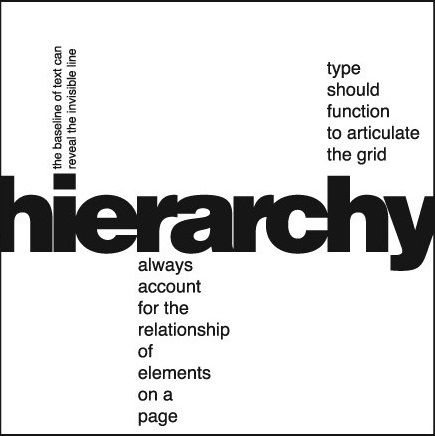
Image from: Factors in Creating an Effective Typographic Hierarchy
Basic Type Hierarchy
01 Primary level
02 Secondary level
03 Tertiary level
04 Other levels
Explore this Site and Watch this Video
https://standardsmanual.com/products/nyctacompactedition
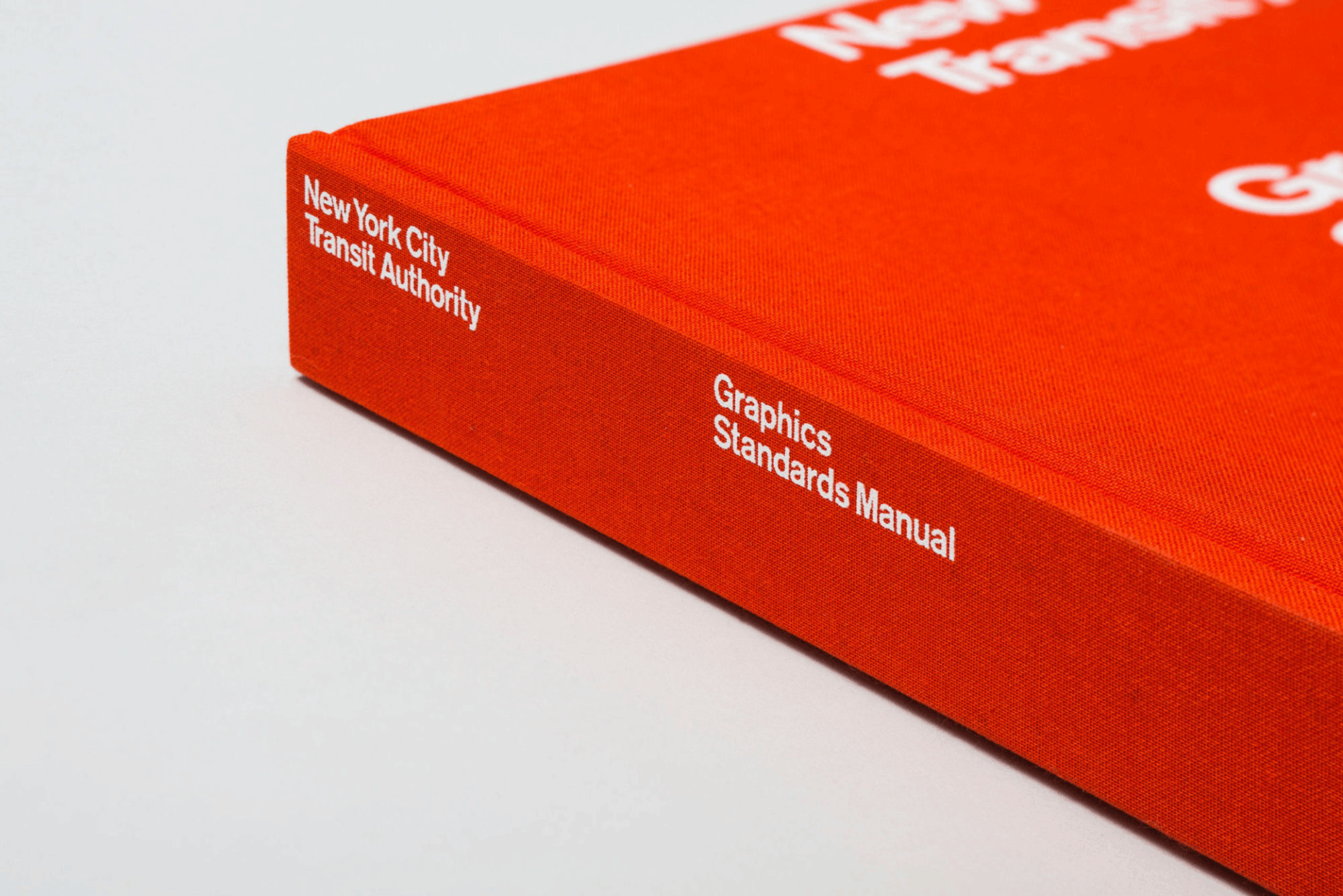
NYCTA Graphics Standards Manual Compact Edition
Look at the posters
https://yveludwig.com/yale-school-of-architecture-poster-series
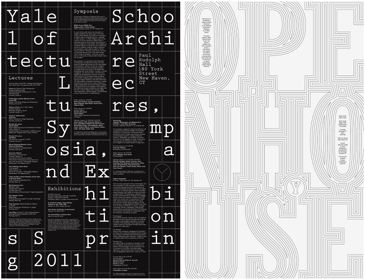
Read about designer Michael Beirut

Read
Graphic Design Thinking / Type Heirarchy / Ellen Lupton
Typographic Hierarchies / Smashing Magazine
Watch
This guy has some great points about hierarchy.
(8minutes)
Post : Beirut Poster Analysis
Choose a Michael Beirut poster from the Architecture Series (link above and here) with powerful typography and briefly discuss the poster in the following way:
- What are the primary and secondary hooks?/ what do we see first and second?
- Count the levels of type. / Size / Weight / italics
- Discuss how it navigates. / eye travels without getting stuck
- What aspect of it creates energy? / Design is exciting to view
- How does it handle white space? / effective structural space
- What makes it work? / overall impression and how it achieves impact
Include an image of the poster you have chosen at the top of the post.
Post due Wednesday, September 3
Category: 02 Type Poster Analysis