- Â
å January 2017
B Figure/Ground Examples
Stable Figure/Ground


Reversible Figure/Ground (can be see two ways)


Ambiguous Figure/Ground: No clear relationship. Goes back and forth.


í 03 Figure/Ground

Use Only Two Letters
Using only two letters create a series of dynamic typographic compositions. There are many forms these compositions can take. Experiment with large and small letters, combining similar forms, contrasting very different letter forms. Ultimately your goal is to create beautiful and dynamic form by playing with letterforms.
Download and install these typefaces.
What is flow?
As a designer one of your jobs is to control the attention of the viewer. By the design choices you make, you guide the viewer around the page. Your compositions will naturally have a flow to them. The viewer will start looking at something on the page and their eyes will move around the composition before coming to rest on a focal point. As a designer you have some influence over this process. Create compositions that activate the gaze and delight the eye.
Objectives
Your objective with this assignment is to:
- Understand how shapes interact to produce foreground and background relationships.
- Create stable, reversible and ambiguous figure/ground compositions.
- Learn how to manipulate letterforms using Illustrator
Rules of the Game
- You may only use two letters per composition.
- You make only use Garamond, Baskerville, Didot, Century, Helvetica.
- You may only scale and rotate.
- Do NOT stretch any letters.
- Both letters must be black on a white background.
- All work must be printed on a laser printer
- All work must be trimmed to size (6″x6″)
- You may use UPPERCASE or lowercase or a mixture of the two.
- You may use only the regular (not bold) and italic fonts of your typeface.
Make 9 Compositions
Make 9 6″x 6″ preliminary compositions in Illustrator using any two letters from the six class typefaces: Futura Bold, Garamond, Baskerville, Didot, Clarendon, Helvetica. Try to use different letters for all the compositions. The purpose of the assignment is the explore the alphabet.
3 composition with a small and a large letter
- Garamond
- Baskerville
- Helvetica
3 compositions with small to medium sized letters
- Century
- Didot
- Baskerville
3 compositions with large letters
- Your choice of typeface
- Your choice of typeface
- Your choice of typeface
Keywords:
large / small / contrast / asymmetry / space / drama / focus / flow
Format: 6″ x 6″ trimmed
Color: Black and White
Output: Laser (no inkjet)
Guidelines for Final Work
- When you print DO NOT use the “Fit to Screen” function located in the print dialog. Print 100%.
- Print from Acrobat if possible.
Due Thursday, February 2
- Print 5 compositions printed on 8.5 x 11″ paper with crop marks. WE WILL TRIM IN CLASS!
- PDF with 9 compositions on DropBox in your your folder:
03_Figure_Ground/lastname.pdf
Due Tuesday, February 7
- Print 9 compositions printed, trimmed in a manilla envelope
- PDF with 9 compositions on DropBox in your your folder:
03_Figure_Ground/lastname.pdf
B Type Anatomy
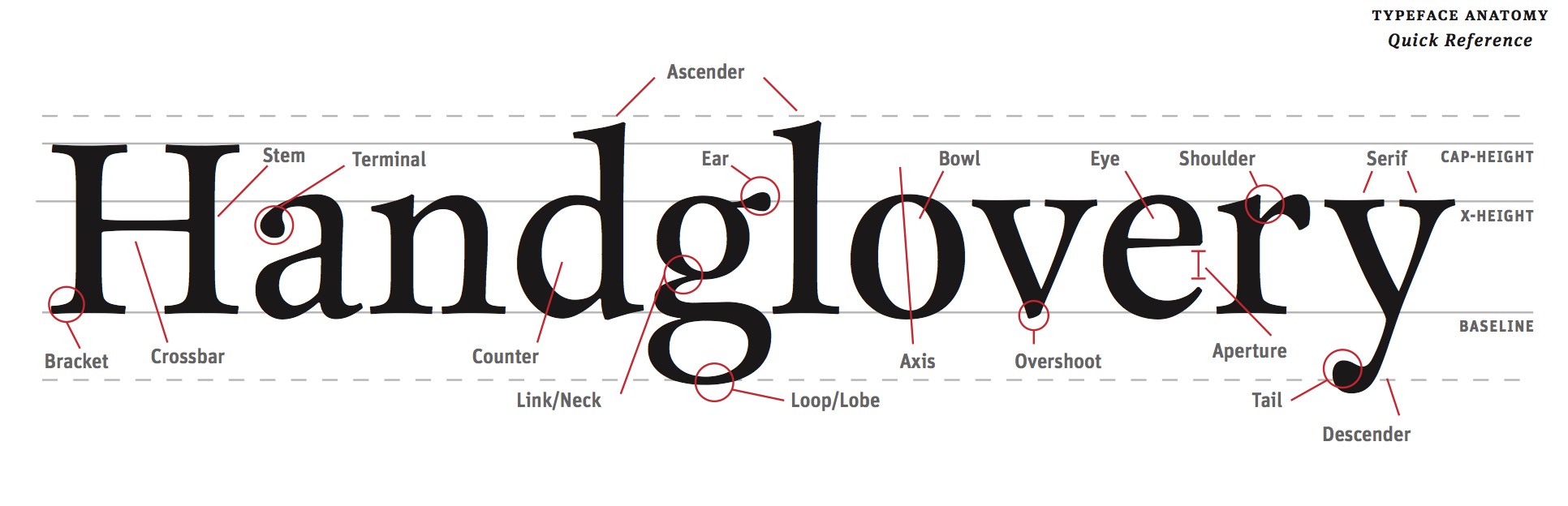
Read
Read this guide about identifying the parts of letter forms.
Explore these Type Anatomy Links
B Illustrator 101
Please use these videos to familiar yourselves with Illustrator
B Printing with Crop Marks
Here are some basic instructions for printing your files with crop marks in the lab.
Select “Print” from the file menu.


Choose the graphic design printer in the lab.

Set the paper size to US Letter (8.5″ x 11″)

Make sure the scaling is set to “DO NOT SCALE”

Select “Marks and Bleeds” in the top left.

Check “Trim Marks”

Uncheck “Use Document Bleed Settings” and make sure the top, bottom, left and right boxes are set to .25 inches.

Click the “Print” button in the bottom right corner.

The print should look like this on the paper. The thin lines are called crop marks.

B The Manila Envelope

1. Get a 9″ x 12″ manilla envelope. (You will likely need 3 or 4.)
2. Write the following neatly in top right corner of the front of the envelope.
3. Write your first name last name on one line.
4. Write the name of your class on the second line.
5. Write “SPRING 2017” on the third line.
7. Insert work neatly inside.


-
Classroom
-

Leave a Reply
You must be logged in to post a comment.